Academator
EdTech & exam preparation
An AI-assisted maths learning app that gives every pupil curated exam practice, a study plan with day-to-day milestones, and real-time feedback on progress.
Why this brief existed.
Academator is an EdTech startup that launched in January 2021 to bring the benefits of artificial intelligence to the learning process and shift unnecessary heavy load from tutors to machines.
The equity argument is the point of the product. Academator wants the best exam practice and curated content available to all pupils, regardless of their parents' budget and regardless of how good their school teachers and private tutors happen to be. The app builds a bespoke study plan with clear day-to-day milestones for each pupil, generates real-time feedback so progress is visible to pupils and parents, and adjusts the plan as those feedback metrics come in.
None of that helps if a fifteen-year-old won't stay in the lesson. A working beta existed; what nobody knew was how it felt to use. That's what the students were sent to find out.
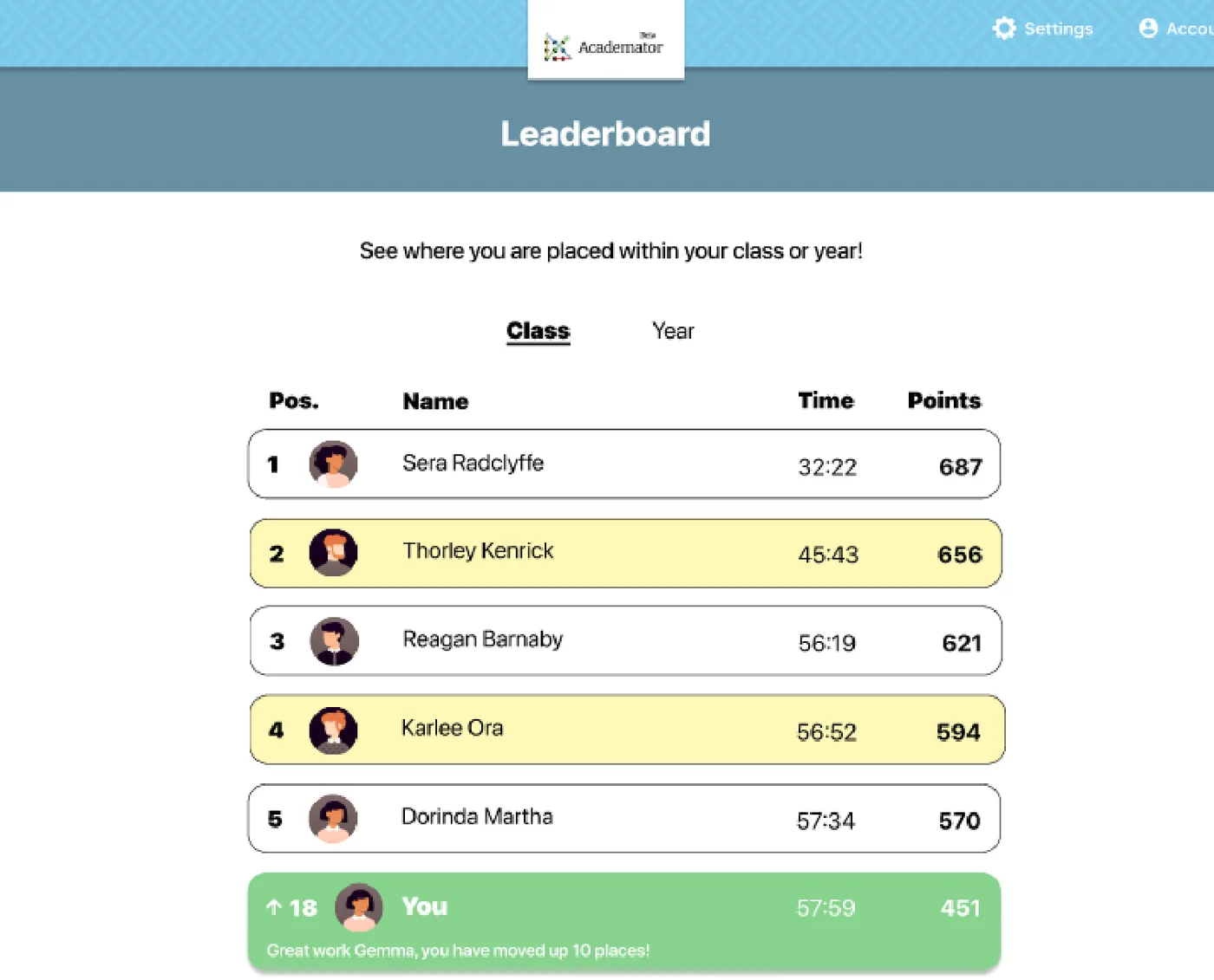
“Do users feel anything similar to when you are in a competitive situation? What if there were a real-time leaderboard with your peers on it?”
What Academator asked for.
Test the live app with the people who would actually use it - GCSE-age students and the tutors who teach them - and come back with evidence. The client wanted a specific answer on one idea it was considering: whether a real-time leaderboard showing your peers would motivate students or put them off.
What the students worked within.
Who the design had to serve
Students aged 15 to 18 working towards maths exams, and the private tutors and teachers who support them. The team deliberately tested across both, because the two groups judge the same screen differently: a tutor is assessing whether their students would engage with it, a student is deciding whether to keep going.
Constraints in the brief
- Not a blank page. A working beta of the app already existed - the job was to test it and evidence what should change, not to invent a product.
- The leaderboard was the client's own idea, put to users for a verdict rather than assumed. The team had to be willing to come back with a no.
- The brief asked the team to record the device each person tested on - computer, tablet or mobile - because the answer wasn't known.
- Testing ran over Zoom and in person, across a cross-section of students and tutors.
What the team had to figure out.
No answers were supplied with the brief. These are the questions the students had to research, argue about and design their way through.
- Does a real-time leaderboard motivate a fifteen-year-old, or does it demoralise the students who are furthest behind - the ones the product most needs to keep?
- The progress bar is meant to reassure. Does anyone actually understand what it's telling them?
- What makes a maths lesson on a screen readable rather than exhausting - length of slide, layout of the question, how the theory is explained?
- The app auto-plays a synthesised voice over the theory. Does that help a student concentrate or drive them out of the lesson?
- When a student gets a question wrong, what should happen next?
- Which elements of the design and UI genuinely stand out, positively or negatively - and on which device?
What the team actually did.
Taken from the team’s own final presentation back to the client — the research they ran, what it told them, and the design decisions it drove. Including the ones that didn't work.
The team defined what needed testing and why, wrote a task list, and ran the first round with four users: one private tutor and three students aged 15. They tested over Zoom and in person.
The first round was unsparing. On the auto-playing narration: "Robotic voice is off putting, hard to follow, would be great if it was an actual voice recording." On orientation: "There's a lack of signposting, are they steps? I don't understand what I am meant to be doing." On the look of it: "The interface was very plain and basic with a dull background colour," and "If the app used more colours it would have been engaging." The tutor was blunt about what that meant commercially: "It would be great to see some colour or branding, I think my students would find it hard to engage with this app."
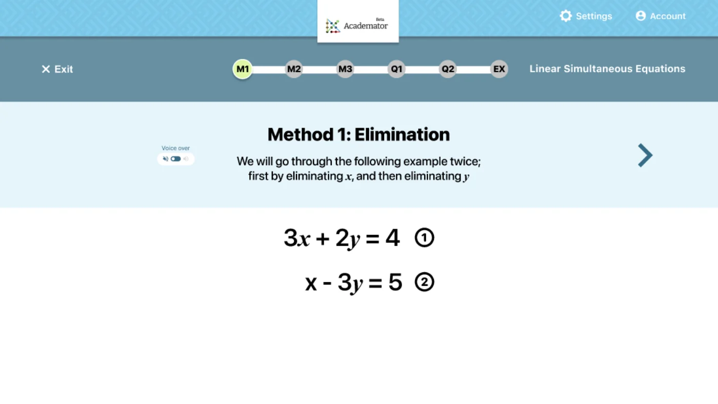
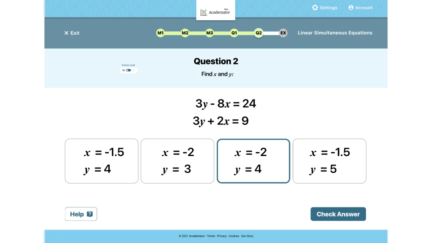
The progress bar - the thing meant to reassure students - was the clearest failure. Users didn't know what the letters on it stood for, thought it was too small, asked whether the last icon was broken, and couldn't tell which parts of it were lessons and which were questions. One user asked outright: "Were the beginning pages questions?"
Not everything was wrong, and the team recorded that too. The question difficulty landed well - "Good way to practice. Questions aren't too easy, good amount of difficulty" - the typography was easy to read, and the "Well Done" animation was singled out as something users liked. Wrong answers were the gap: users wanted an explanation for each section they got wrong, and links back to the lesson it came from.
On the leaderboard, the client's own question, the answer came back split and the team reported it split rather than picking the flattering half. One student saw the pull - "if there was challenges to improve your score and rise up the leaderboard". Another named the risk exactly: "If you were good at the lesson, great motivation, demoralising if you're down the bottom." A third said it "gives unnecessary pressures especially if you aren't doing well," and the tutor didn't think it was a good idea at all.
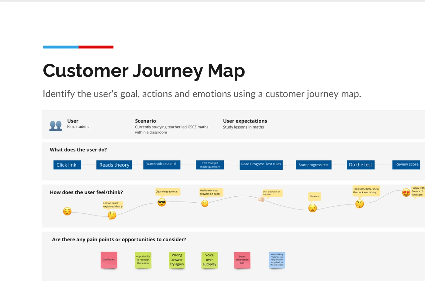
The findings went into a customer journey map, and from there into three hypotheses stated in a form that could be proved or disproved: higher active users and a lower drop rate if a progress bar gives the student motivation and concentration; more subscribers if a clearer question layout helps a self-study learner get a higher grade; a stronger community if a leaderboard gives students reward and competitiveness.
They built low-fidelity wireframes to settle the structure of the content and the interface before committing to detail, turned those into a first stage of designs, and tested again with teachers and students.
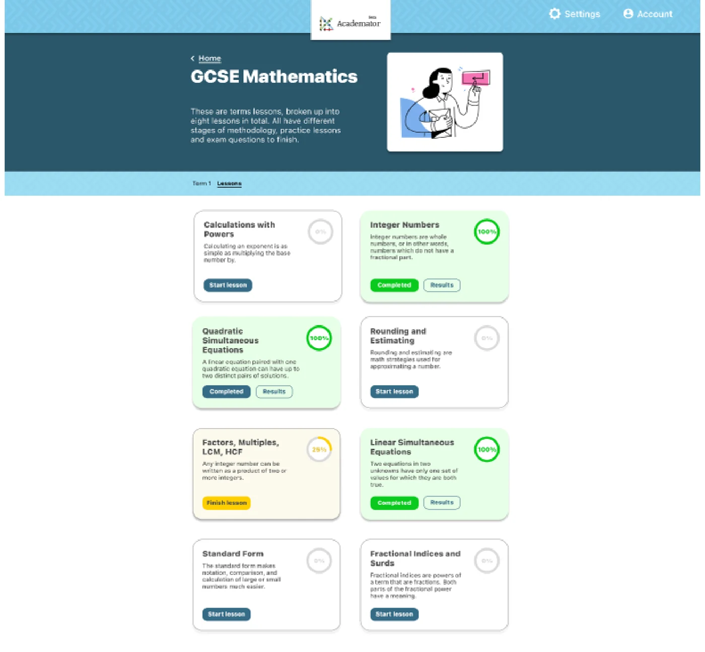
The second round showed the changes working. "I like the break down of the classes, I can clearly see the blocks are lessons." "Being able to pick up a lesson from where I left off is a great idea, as I don't feel pressured into finishing a lesson in one go." The colour work landed - one user noted the knocked-back shades of red and green used for wrong and right answers weren't shouty - and the app now felt inviting enough that a user wanted to explore it.
The progress bar was still contested in round two, which the team reported honestly: one user found it motivating with many slides to get through, another still didn't feel it told them where they were in a lesson, and a third wanted dots between each page to make the slides explicit. The leaderboard stayed split as well. New asks emerged for step-by-step working on progress tests and a pop-up video for a student stuck on a question.
Next steps went back to the client as a list: apply the improvements from the latest round, build a representative colour palette that also meets accessibility standards, create personas from further testing, and refine the icons, buttons and typography.
The actual work.
Design artefacts from the deck the team presented to Academator.
Every cohort gets a real brief.
UX Academy courses are 100% live online, capped at 10 students, and built around a genuine client brief rather than a simulated exercise. Students work to the client’s real constraints and present their work back to the client — which is what turns a course project into a portfolio piece you can talk through in an interview.
Courses that cover this kind of work.
Want a brief like this on your CV?
Get the full curriculum and see how the client project runs.
Work on a real brief. Build your portfolio.
Speak to an advisor about whether this is a realistic move for you, or browse the courses to find your fit.