AURA
for ClickedDating · Dating & relationships
A dating app from ClickedDating, built around a colour-based personality system meant to help users understand and trust their matches, alongside a faster, simpler onboarding flow.
Why this brief existed.
There wasn't an existing AURA app for the students to design from, so they also studied Clicked, the client's other app, to understand its design direction. The starting focus was onboarding, because ClickedDating had previously had feedback that Clicked's onboarding process could feel too long: "there were some feedback that you had received in the past that your other app's onboarding process was maybe a little too long."
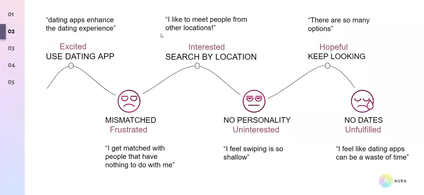
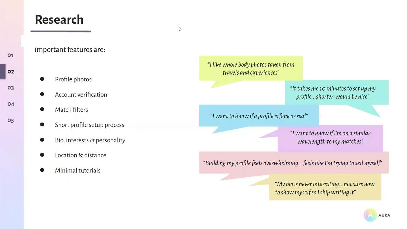
Early research confirmed users wanted "shorter onboarding processes" and "a quicker way to do things like building their profile", and that building a profile could feel overwhelming.
But the stronger finding was about matching, not onboarding: "one of their biggest pain points was that they just didn't feel like they were getting accurate matches." The students noted this might not be the matching algorithm itself so much as whether users could actually see or understand why someone was a good match - and when they couldn't, "they feel that they're not really getting what they want out of the app", which could mean "ultimately dropping it and moving on to the next one." That reframed the project: helping users recognise and understand accurate matches became the primary goal, with easier onboarding as the secondary one.
“help you create an user experience for your new dating app called Aura.”
What ClickedDating asked for.
Design the user experience for ClickedDating's new dating app, AURA - starting from onboarding, which had drawn feedback that it could feel too long on the client's other app, and expanding once research pointed at a bigger problem: users not feeling they were getting accurate matches.
What the students worked within.
Who the design had to serve
Users of ClickedDating's dating apps who told researchers they wanted shorter onboarding and matches that felt genuinely accurate - plus, as one client participant raised directly during the presentation, people who are colourblind and can't rely on colour alone to read a match.
Constraints in the brief
- The students had seven weeks to design a usable onboarding experience and features intended to help users match more effectively based on personality.
- No existing AURA app existed to design from - the client's other app, Clicked, was the closest reference point for style and direction.
- The colour-based personality system had to build on an idea the client had already proposed: A/B personality questions used to build a personality profile.
What the team had to figure out.
No answers were supplied with the brief. These are the questions the students had to research, argue about and design their way through.
- How might we help users find more accurate matches using a personality trait marker system based on colour?
- How might we create an easy onboarding process incorporating this system?
- Should users be able to choose the kind of compatibility they want - a Perfect Match built on similar answers, Opposites Attract for contrast, or something more unpredictable?
- How do you make a colour-based matching system work for someone who is colourblind?
What the team actually did.
Taken from the team’s own final presentation back to the client — the research they ran, what it told them, and the design decisions it drove. Including the ones that didn't work.
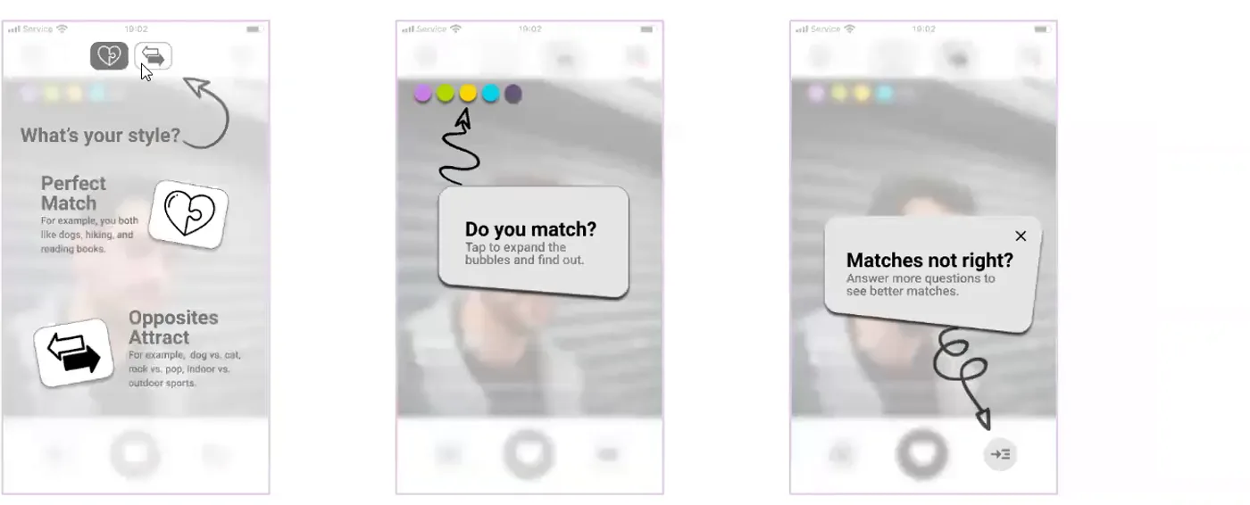
The students built on an idea the client already had - using A/B personality questions to build a personality profile - and developed it into a colour-based system that also tied into the AURA name. Personality questions would generate visible colour markers on a user's profile, giving people another way to read a potential match at a glance. Anais described the concept as "a visible trait marker, kind of like a code that is learnable with time" - the idea being that users would gradually learn what colours represented through using the app, rather than inspecting every profile in detail. One example given was that "purple means people like animals or they're animal lovers."
The students also explored giving users control over the kind of compatibility they wanted. Perfect Match would focus on similar personality answers and traits, while Opposites Attract would let users explore people with contrasting answers. They had also considered a third option, "the wild card", described as "a completely wild option or wild list of people to meet" - built on research into how mood affects the way someone uses a dating app. Yannis explained the thinking: "I'm looking at perfect matches but I'm not feeling like that right away. I want to do something a bit more exciting or I want to see what's out there." The client responded well to the idea: "I personally really like it and I hadn't thought to ask it before, so I think it's a really interesting idea."
An important challenge came up live during the client presentation, when one of the client participants said: "I'm actually colorblind." They raised the concern that a matching system built on colour could be hard for them to decode. The students responded by discussing putting icons or symbols inside the colour markers so meaning wouldn't rely on colour alone, and floated a "colorblind mode" as a further option.
The final Key Frames section brought the concept together around four areas: tested usability, short tutorials, learnable design and accurate matches - showing how users could learn the personality system through the interface, understand Perfect Match and Opposites Attract, and use the personality information when reviewing potential matches.
The students had seven weeks in total. With more time, they said they would have researched the impact of Perfect Match and Opposites Attract further. For future development, they suggested exploring a gamified chat experience as a paid membership feature, potentially in collaboration with gaming and food-delivery apps.
The actual work.
Design artefacts captured from the recording of the team's final client presentation.
Who did the work.
Every cohort gets a real brief.
UX Academy courses are 100% live online, capped at 10 students, and built around a genuine client brief rather than a simulated exercise. Students work to the client’s real constraints and present their work back to the client — which is what turns a course project into a portfolio piece you can talk through in an interview.
Want a brief like this on your CV?
Get the full curriculum and see how the client project runs.
Work on a real brief. Build your portfolio.
Speak to an advisor about whether this is a realistic move for you, or browse the courses to find your fit.