Blindlee
Dating & social video
A blind-dating app where the video call comes first: matches talk blurred, and only unblur when both choose to.
Why this brief existed.
Blindlee inverts the order of a dating app. Instead of judging a photo and then talking, two people are put on a live video call with the image blurred, and the blur comes off later - during the call - once there's a reason for it to. Personality goes first; looks are still part of the equation, just not the first filter.
That design choice creates the product's central problem, and the founder named it precisely: because Blindlee calls are synchronous, there isn't always someone available on the other end of the line. It's a classic network effect problem. The app only works when two people happen to want a call at the same moment.
The stakeholder interview turned that into a list of symptoms the team could design against. People get discouraged because nobody picks up. There aren't enough people on the app at the same time. Calls cut off, and when they do the two parties can no longer match each other. If there's nobody to interact with, there's no incentive to stay - and there isn't enough to do while you wait.
The demand was real, which made the engagement gap more frustrating rather than less. Press coverage at the time reported a survey of 162 users in which 58 per cent hoped to meet their blind date in person as soon as they could, 22 per cent said they used Blindlee for solidarity and moral support or just to have someone to talk to during lockdown, and 17 per cent were simply bored. People wanted to be there. They just couldn't always find each other.
What Blindlee asked for.
Improve the user experience to maximise engagement. The primary goal was getting users onto a live video call - and, when that isn't possible because nobody else is around, giving them something worthwhile to do in the app instead.
What the students worked within.
Who the design had to serve
Single people aged 23 to 40 looking for something more meaningful than casual dating, for whom personality is an important part of the equation. Press coverage described the user base as university students through to young professionals - people who grew up with the internet and video culture, so a video call is already a comfortable medium of expression for them.
Constraints in the brief
- The core mechanic wasn't up for redesign. Calls are synchronous and the video starts blurred; the team had to improve engagement around that, not remove the thing that makes Blindlee Blindlee.
- A clear goal hierarchy: get people onto a live video call first, and only fall back to asynchronous features when that genuinely isn't possible.
- Quality over quantity. The client was explicit that the goal was current users having a better time, not a bigger sign-up number.
- Beauty is deliberately not the first filter - it arrives later in the call, at the unblur - so nothing in the design could quietly reintroduce photo-first browsing.
What the team had to figure out.
No answers were supplied with the brief. These are the questions the students had to research, argue about and design their way through.
- How might we encourage users to stay more engaged on the app?
- What's there to do on Blindlee when there's nobody to call - and can that be good enough to keep someone there until there's?
- How do you make other people's availability legible, when the whole product depends on two people being free at the same moment?
- A call can cut off and take the match with it. What should happen then?
- What does maximising engagement actually mean here - time in the app, calls started, or people coming back?
What the team actually did.
Taken from the team’s own final presentation back to the client — the research they ran, what it told them, and the design decisions it drove. Including the ones that didn't work.
Research started wide: the brief, press coverage of the app, a stakeholder interview with the founder, and user interviews with people who use online dating apps. The team wanted to know how people behave on dating apps generally, not just on this one.
That produced a first How Might We: how might we help users get comfortable using the blurred video? It was a reasonable question. It was also, as the team put it on their own slide, the wrong one - they had designed towards making users more comfortable with blurred video without actually solving the problem the client had described.
So they stopped and went back. They took the work to the founder for feedback, wrote a new How Might We, ran another round of Crazy 8s, built an empathy map and customer journey, and rebuilt the concept from there. Their instructor's note on this is on the slide: design is an iterative process, it's normal to question an outcome and take a step back, and designers should get comfortable with that.
The second round of research said the same thing the founder had, but in users' own words: no one ever picks up, no matches, can't see who's available, having to manage a do-not-disturb setting by hand, never managing to find anyone to talk to.
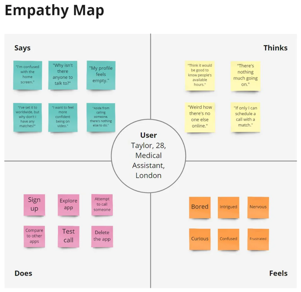
The empathy map turned that into the feeling of opening the app: "I am confused with the home screen." "There's nothing much going on." "Why is there nobody to talk to?" "My profile feels empty." "Weird how there's no one else online." An empty room, essentially - and an empty room is a design problem, not a supply problem.
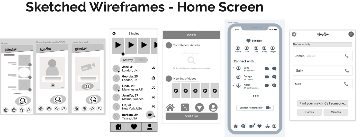
The revised question became: how might we encourage users to stay more engaged on the app? The team mapped the customer journey against it and sketched wireframes for the home screen, which was where the emptiness was being felt.
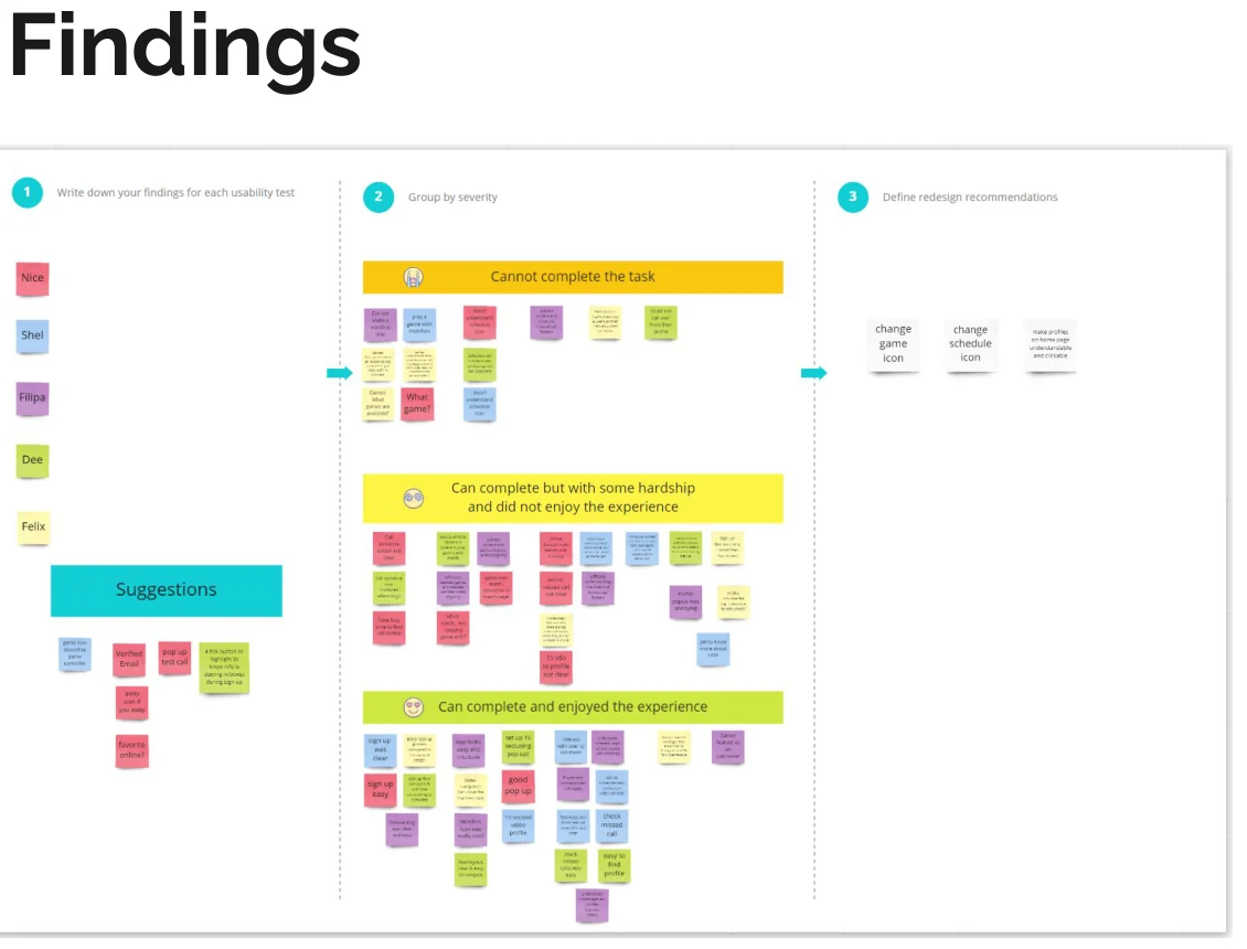
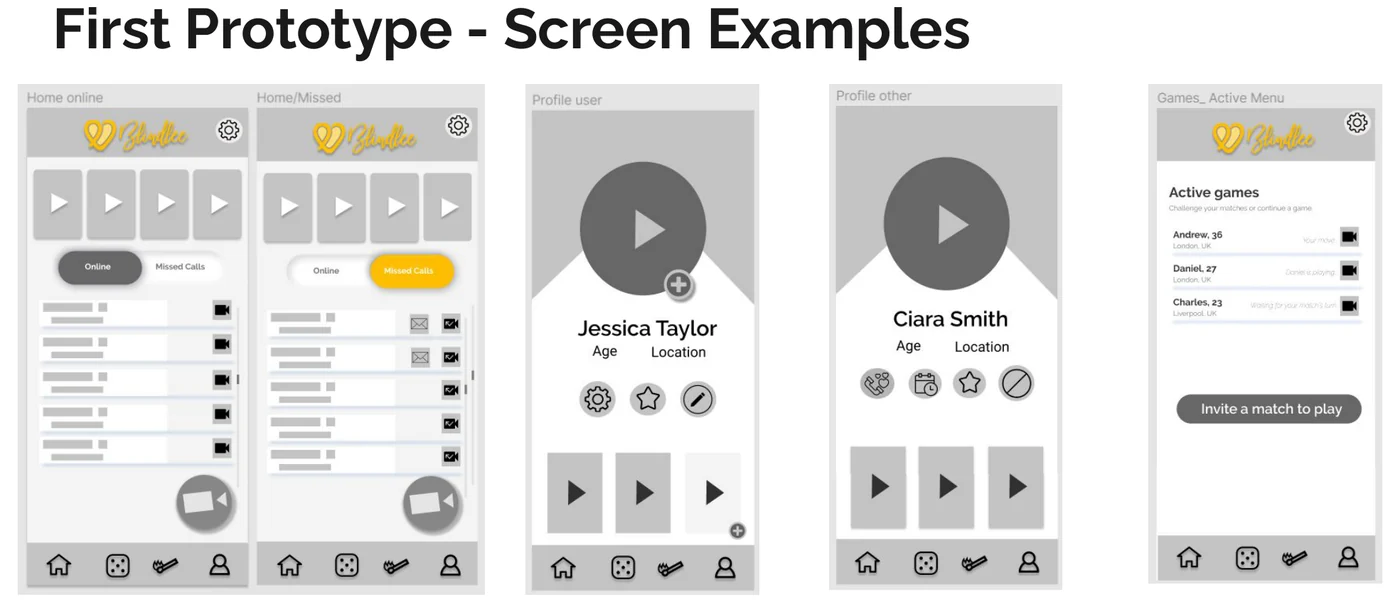
Usability testing on the first prototype gave a clean split between what worked and what didn't. The app was easy to understand and intuitive, and the matches icon was singled out - "I love the matches icon!" Two of the new ideas weren't landing: the games weren't clear, and testers didn't understand the scheduling feature, which is notable given scheduling was aimed squarely at the availability problem.
The team iterated the screens off the back of that and delivered a final Figma prototype, presented to the client with the pivot included rather than tidied away.
The actual work.
Design artefacts from the deck the team presented to Blindlee.
Who did the work.
Every cohort gets a real brief.
UX Academy courses are 100% live online, capped at 10 students, and built around a genuine client brief rather than a simulated exercise. Students work to the client’s real constraints and present their work back to the client — which is what turns a course project into a portfolio piece you can talk through in an interview.
Courses that cover this kind of work.
Want a brief like this on your CV?
Get the full curriculum and see how the client project runs.
Work on a real brief. Build your portfolio.
Speak to an advisor about whether this is a realistic move for you, or browse the courses to find your fit.