Charrli
E-commerce & zero-waste retail
A refill marketplace for household essentials in reusable packaging, collected and refilled by Charrli.
Why this brief existed.
Charrli exists to do three things: reduce single-use waste, support local shops, and support ethical and sustainable brands. The mechanic is a refill loop - home essentials delivered in reusable packaging which Charrli collects when empty - and the subscription is what makes the loop repeat. "Refill your routine" is the promise on the homepage.
The client's own read on the site was unusually candid and became the starting point for the project: confusing UX, difficult to navigate, a value proposition that isn't transparent, an unclear user journey and derived value that isn't obvious.
The team's website review found the same things from the outside. Navigation was difficult, the language wasn't clear, search filters were hard to find, users wanted more control over search and would have liked a guided experience, product photography was high quality but detailed descriptions were missing, and the mobile experience was difficult to use.
Underneath all of it sat one specific failure. The subscription - the feature the whole business model depends on repeating - couldn't be self-served. Customers had to email Charrli to change it.
“Confusing UX and difficult to navigate site. Value proposition is not transparent. User journey is not clear and derived value is not obvious.”
What Charrli asked for.
Fix the subscription experience. Customers couldn't find, understand or change their own subscriptions on the site, and were emailing Charrli to make amendments that they should have been able to make themselves.
What the students worked within.
Who the design had to serve
Existing Charrli customers with active subscriptions: people motivated by cutting single-use plastic and supporting local independent shops, who are time-poor and want deliveries to be simple. The persona the team settled on was a working parent in her thirties in East London, an active member of an eco community and a long-term subscriber - someone already sold on the mission and being let down by the mechanics.
Constraints in the brief
- The redesign had to live inside the existing site and its account area, not replace it.
- Scope had to be cut. Research surfaced five insight areas - delivery issues, irrelevant suggested items, subscription issues, site navigation and lack of information - and the team deliberately struck out three of them to work properly on delivery and subscriptions.
- Subscriptions and the reusable-packaging collection loop are the business model, so nothing in the redesign could make subscribing feel like a trap. Making it easy to cancel was part of making it safe to start.
- Charrli sells through local independent refill stores, so what's available depends on where the customer is.
What the team had to figure out.
No answers were supplied with the brief. These are the questions the students had to research, argue about and design their way through.
- How might we simplify the subscription area?
- How might we make the subscription process easier to understand and use?
- How might we make it easier to add, change or remove items from a subscription?
- How might we make navigation within the subscription page flow smoother?
- Automating a repeat order stops people browsing. How do you keep a subscriber discovering new products without undoing the automation that made them subscribe?
What the team actually did.
Taken from the team’s own final presentation back to the client — the research they ran, what it told them, and the design decisions it drove. Including the ones that didn't work.
The team opened with a value proposition canvas, putting Charrli's product features next to what a typical customer actually wants. On the customer side: producing less plastic waste, scheduled deliveries, quick and easy shopping, supporting local businesses, and a clear conscience. On the product side: reducing single-use plastic, supporting local shops, ethically sourced products. The two lists matched. The gap was in the execution, not the proposition.
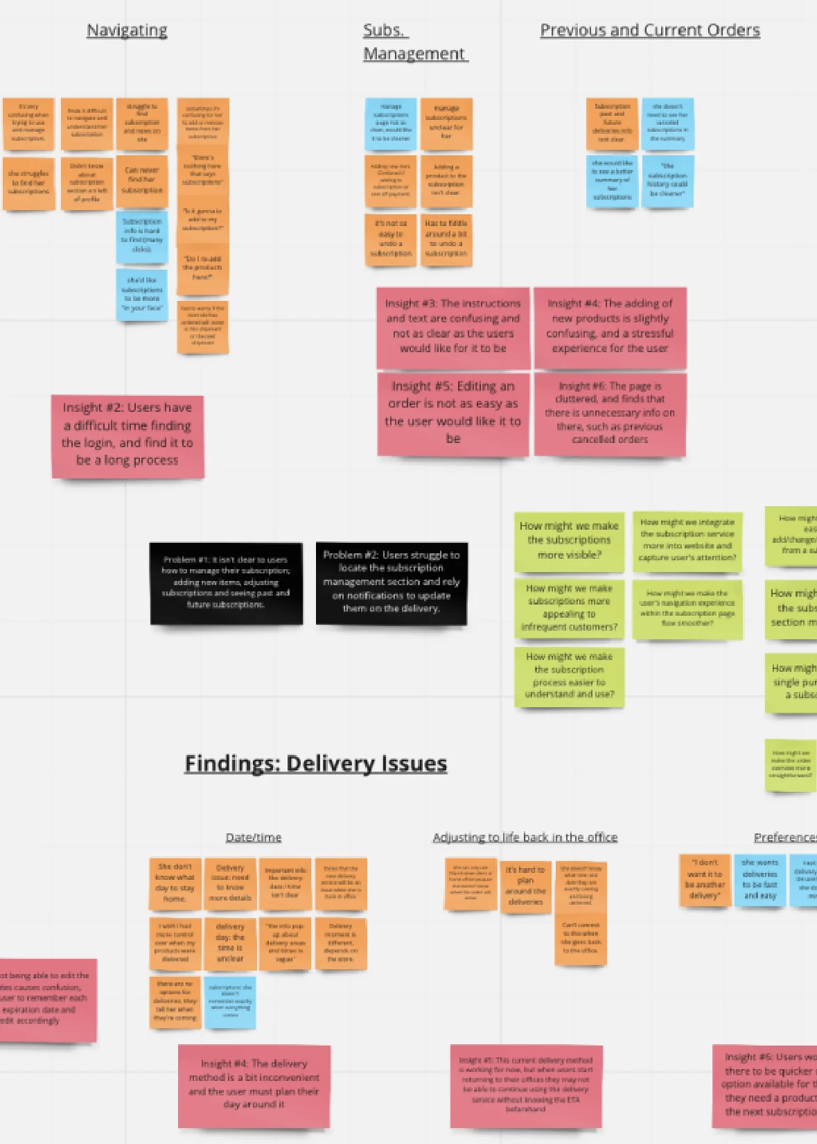
They then walked the existing subscription journey end to end and mapped it in two halves - finding and reviewing subscriptions, then editing and adding to them - recording the touchpoint, the customer's thought and the customer's feeling at each step. The thoughts read as a running commentary of confusion: "How do I get to my subscriptions?" "Where are my subscriptions?" "Found my subscriptions - great!" "How do I edit my subscription?" "What's the difference between refill date and delivery date?"
Customer research turned that into quotes with real consequences attached. On deliveries: "I never know my delivery date, only when I receive a text." "I wish I had more control over when my products were delivered." "It's hard to plan around the deliveries." One customer stated the churn risk outright - they couldn't commit to Charrli if it stayed like this once they were back in the office.
On subscriptions: "I love the ease of the subscription service, but I struggle to manage it on the Charrli site - I have to fiddle around a bit." "I subscribe so there's only one delivery." "There's nothing here that says subscriptions." And, hovering over an ambiguous button: "Is it going to add to my subscription?"
Three insights came out of the delivery research: users get confused about which store is their local one and want location and delivery time pre-defined automatically; users don't know the date or time of their deliveries for certain, and that uncertainty causes anxiety; users want complete control over delivery dates and times.
Three more came out of the subscription research, including one the client wouldn't have wanted to hear: because the subscription is so automated, users had stopped browsing the site and stopped discovering products. The automation that made the model work was quietly starving the catalogue of attention.
The team wrote the problem in the persona's own voice - an existing long-term customer trying to add products to her subscription, wanting to self-serve, having to email Charrli instead, and finding it annoying because self-managing an existing subscription was impossible.
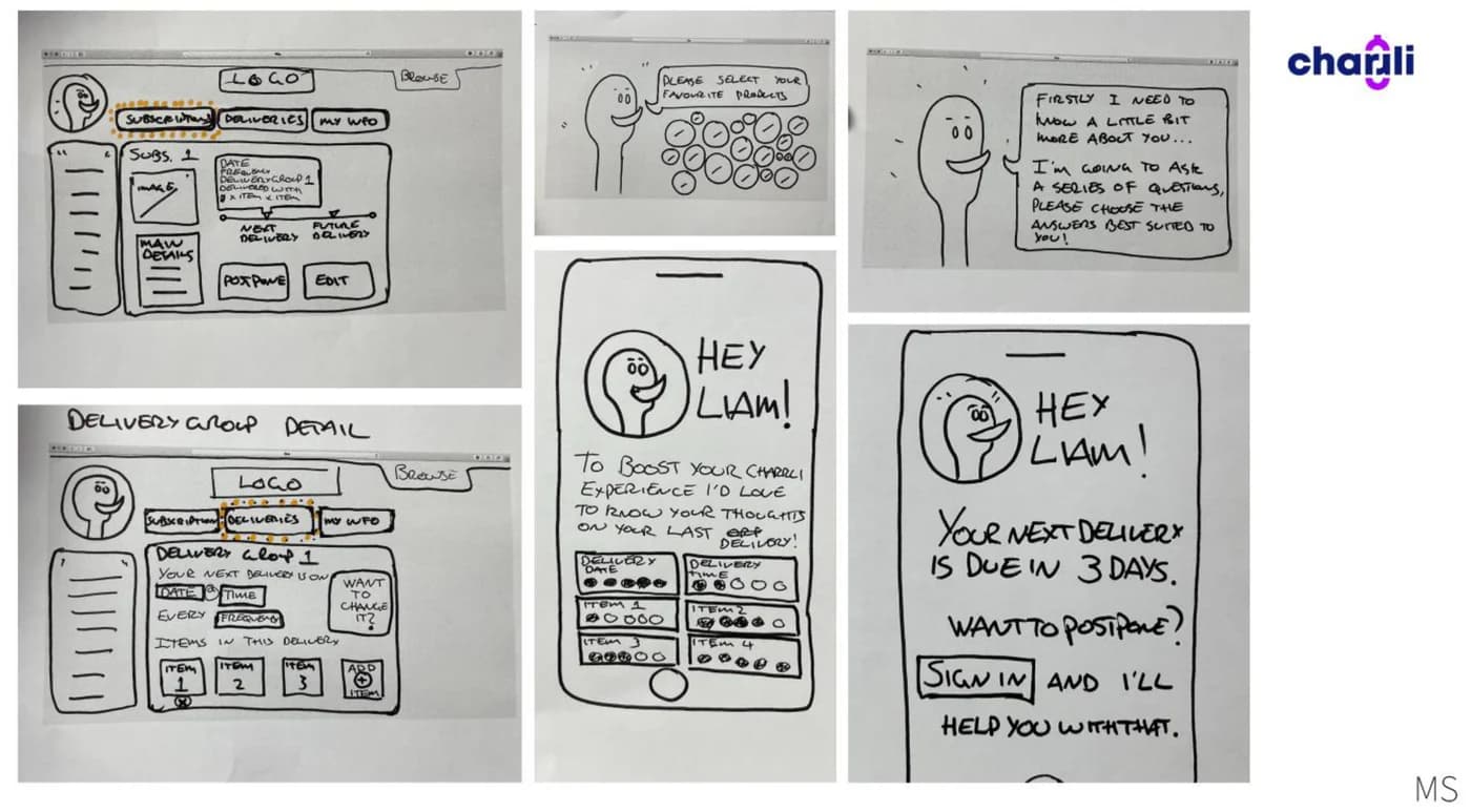
Sketching produced four directions: introduce a Charrli personal assistant, simplify the subscriptions section, show relevant products, and simplify the navigation. The assistant - drawn as a genie - was the team's answer to the discovery problem: something that asks what you use and how often you need a refill, then suggests a subscription shape, so recommendation happens through conversation rather than through browsing the customer has stopped doing.
Wireframes set the rules: a cleaner look, easily navigable, only the information the user needs, clear wording, an easy-to-follow subscription process, and a cart carrying all the necessary information. The account area was rebuilt around an order schedule, active and paused subscriptions, and an explicit next delivery date.
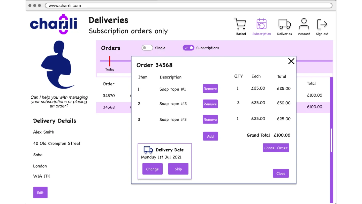
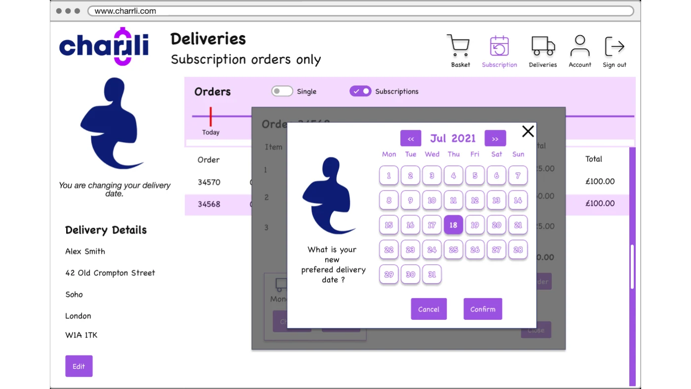
The hi-fi prototype worked through the whole editing flow rather than a hero screen. Deliveries can be filtered to single orders or subscription orders. An order opens as a modal with each item, quantity and delivery date in one place. Removing an item shows an undo. Cancelling an order offers skipping a month first, rather than treating cancel as the only exit. Changing a delivery date opens a calendar and asks a plain question: what's your new preferred delivery date?
Recommendations went back in two groups. For subscriptions: encourage them throughout the experience, make "my subscriptions" more accessible, visualise delivery dates and times, simplify the information shared, and make editing intuitive. For deliveries: flexible, easily editable, and easier to reach. The assistant was proposed as an ongoing relationship rather than a widget - predicting when a product will run out, tailoring recommendations, checking in on subscribers and following up on cancellations.
The actual work.
Design artefacts from the deck the team presented to Charrli.

Who did the work.
Every cohort gets a real brief.
UX Academy courses are 100% live online, capped at 10 students, and built around a genuine client brief rather than a simulated exercise. Students work to the client’s real constraints and present their work back to the client — which is what turns a course project into a portfolio piece you can talk through in an interview.
Courses that cover this kind of work.
Want a brief like this on your CV?
Get the full curriculum and see how the client project runs.
Work on a real brief. Build your portfolio.
Speak to an advisor about whether this is a realistic move for you, or browse the courses to find your fit.