Fledglink
Careers & early talent
A mobile app connecting young people to impartial career guidance and employers: CV, job search and tests.
Why this brief existed.
Fledglink is built for teenagers who are trying to work out what to do next and have nobody obvious to ask. It gives them impartial career guidance, a digital CV, attitudinal tests, a blog and a route to employers - the things a well-connected adult would otherwise supply.
The team's research found the app wasn't meeting that goal, and wrote the reason down plainly: the organisation of the content and the difficulty of the language were making the service unusable for the people it was for. Teenagers were unable to use the app properly, and were going outside it for help - which is exactly the outcome Fledglink exists to prevent.
The language finding was the sharpest of the three. Job titles and descriptions were written in the vocabulary of recruitment, not of a sixteen-year-old. One student, looking at a role: "I don't understand what's an analyst." A job you can't understand is a job you can't apply for.
What Fledglink asked for.
Improve the job-search features and lift three numbers: completed digital CVs, job applications made through the app, and connections between users.
What the students worked within.
Who the design had to serve
Young people roughly 15 to 19. The research split them into two groups with genuinely different needs: the younger end didn't know how to write a CV or how to find out about jobs at all - "I don't know how to write a cv" - while the older end were focused on the network and on actual job opportunities: "I want to know what my friends are doing."
Constraints in the brief
- A live app, not a concept. This was improving features that already existed and were already being used.
- The prototype was built for an iPhone 6, on the team's own reasoning that most of the teenagers they were designing for can't afford the latest model of phone.
- A team of three, working to a specific set of outcomes the client wanted moved rather than an open remit.
- Nine qualitative interviews across a four-year age range - a narrow sample that had to be read carefully, because the two ends of it wanted different things.
What the team had to figure out.
No answers were supplied with the brief. These are the questions the students had to research, argue about and design their way through.
- The majority of users ignored the navigation at the bottom of the screen and never found the features behind it. How do you get a teenager to the digital CV, the network, the blog and the attitudinal tests?
- Some filters are simply irrelevant to a teenager's needs. Which ones earn their place, and where in the journey should filtering happen at all?
- How do you rewrite job titles and descriptions so a fifteen-year-old understands what the job is, without patronising a nineteen-year-old?
- One product, two audiences: the younger group needs help building a CV, the older group wants the network. Can the same homepage serve both?
- What's the first thing a new user should be asked, if the homepage is going to be tailored to them?
What the team actually did.
Taken from the team’s own final presentation back to the client — the research they ran, what it told them, and the design decisions it drove. Including the ones that didn't work.
Nine qualitative interviews with users aged 15 to 19 came first, and immediately produced a split the brief hadn't specified: the younger users needed help writing a CV and finding out about jobs, the older ones cared about the network and the opportunities. The same app was being asked to do two jobs.
Three insights came out of the research. Navigation: the majority of users ignored the navigation tools on the bottom bar, and with them the features the app offered. Tools: some of the filters were irrelevant to teenagers' needs. Language: the wording used on job titles and descriptions was too difficult.
The team wrote a formal problem statement rather than jumping to screens - that Fledglink is intended to find suitable jobs for teenagers, that the service wasn't meeting that goal because of content organisation and difficult language, that this was causing teenagers to look for outside help, and that fixing it should show up in completed CVs, applications, connections and clicks on features like the attitudinal tests.
Personas and journey maps followed, mapped across discovery, findings and applying. The pain points were consistent across both personas: hard to find the app through a search in the first place, unable to apply through the website, difficult to navigate, confused by irrelevant information, too many filters, and job descriptions that were hard to understand.
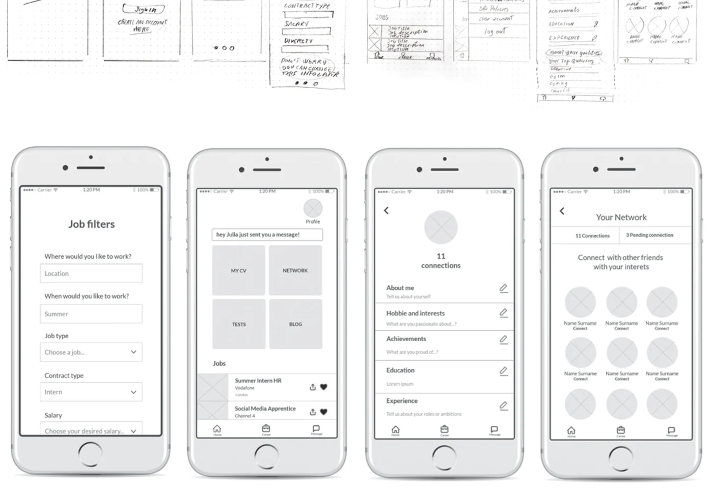
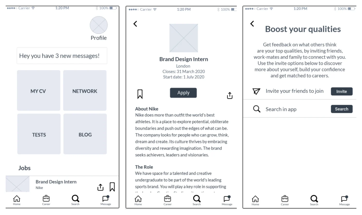
Scoping the MVP, the team worked backwards from the first action a user has to take rather than from the most interesting screen. Three must-haves came out of that. First, collect more detail at sign-up, so the homepage can be tailored. Second, rebuild the homepage around what users actually said they wanted - CV, network, attitudinal tests and blog moved to the centre and prioritised by need. Third, simplify the language that had defeated people in the interviews.
They sketched on paper, built a low-fidelity digital prototype and ran three user tests on it. Feedback was broadly positive - "It's quite complete, I don't need more functions" from a seventeen-year-old, "I like that you can boost your qualities" from a fifteen-year-old - and users liked being able to connect with other people.
Two changes came directly out of watching people use it. Testers raised privacy concerns, so a privacy settings option was added to the profile letting users decide what other people can see. And a heart icon used for saving a job or a blog post was being read as a rating, the way it works on Instagram - so it was replaced with a bookmark. Small changes, but both came from observation rather than opinion.
The actual work.
Design artefacts from the deck the team presented to Fledglink.
Who did the work.
Every cohort gets a real brief.
UX Academy courses are 100% live online, capped at 10 students, and built around a genuine client brief rather than a simulated exercise. Students work to the client’s real constraints and present their work back to the client — which is what turns a course project into a portfolio piece you can talk through in an interview.
Courses that cover this kind of work.
Want a brief like this on your CV?
Get the full curriculum and see how the client project runs.
Work on a real brief. Build your portfolio.
Speak to an advisor about whether this is a realistic move for you, or browse the courses to find your fit.