Known2me
Professional networking & contacts
A contact-sharing and professional-networking product built around a personal 'K-Card', designed to help people exchange details and keep connections up to date.
Why this brief existed.
Known2me is a contact-sharing and professional-networking product designed to help people exchange contact information and keep their professional connections up to date. The students' research identified a central challenge: potential users already relied on established tools such as LinkedIn, WhatsApp, Telegram and email, so Known2me needed to demonstrate a clear additional benefit rather than simply provide another place to store contact details.
The team defined the problem directly: "Users may not see the need of the app / may not find it very useful", which led to the design question "How might we... show people that the app can be useful to them?" One participant put the adoption challenge in a single line: "what's the benefit actually compared to LinkedIn?" The team explored whether automatically syncing information from other platforms to a user's K-Card could make the product's usefulness clearer.
The product also faced a network-effect problem: its usefulness increases when the people around a user also use it. One participant described this as "they kind of also need to use it for it to work really", which made demonstrating Known2me's value one of the project's main design challenges.
What Known2me asked for.
Show potential users that Known2me is genuinely useful when they already have LinkedIn, WhatsApp, Telegram and email for the same job - and use research and usability testing to find out where the product needed to change to get there.
What the students worked within.
Who the design had to serve
People who make new professional connections and want an easier way to exchange details and keep them current - already using LinkedIn, WhatsApp, Telegram and email for the same job. Timing mattered too: some told researchers that if they didn't connect with somebody within a week, they forgot about it.
Constraints in the brief
- The product had to prove itself against tools users already had and already trusted, rather than against no alternative at all.
- A network-effect product: it only becomes more useful as more of a user's contacts also use it, which the team could not design around, only for.
- The team couldn't rely on privacy messaging alone to build trust - research found that simply stating data security wasn't enough on its own.
- Feedback interactions had to stay quick and low effort; participants preferred star ratings or similar interactions over writing an open response.
What the team had to figure out.
No answers were supplied with the brief. These are the questions the students had to research, argue about and design their way through.
- How might we show people that Known2me can be useful to them?
- Would automatically syncing information from other platforms to a user's K-Card make the product's usefulness clearer?
- How do you ask for feedback at the right point in the journey without it becoming intrusive?
- How do you build trust around sharing personal data when a security-only message isn't enough on its own?
What the team actually did.
Taken from the team’s own final presentation back to the client — the research they ran, what it told them, and the design decisions it drove. Including the ones that didn't work.
The students interviewed potential users about how they make new connections, maintain professional relationships, exchange details and use existing networking tools. Around 40% of interviewed users felt phone calls were becoming less relevant to professional networking, and several said the timing of making a connection mattered: one described it as "if I don't do it for a week, I forget about it." The research also found that Covid had moved more networking online and reduced opportunities to make new contacts through physical events.
On feedback, participants wanted the experience to be quick and low effort - summarised by one as "the easier, the quicker, the simpler, the better" - with a preference for star ratings over writing an open response, and timing that didn't feel intrusive. The client responded well to this finding: "I really like the, the thing about there about the timing", and more broadly called it "all really good feedback."
Research also challenged the idea that privacy messaging alone builds trust. The students put it plainly: "Just to say nowadays, yeah, we are 100% data secure is not, is not enough." At the same time, participants were more willing to share information when the benefit was clear: "if it benefits me in the end of the day, I'm happy to share my data." That suggested Known2me needed to communicate both why users could trust the service and what they got back for sharing their information.
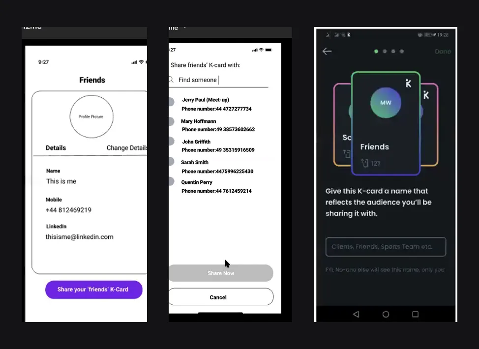
The students tested their prototype with users and documented what worked, what caused problems, and what they changed as a result. Testers liked the simple feedback format, the option to add extra detail, the QR-code feature for networking events, and the product's professional focus. Testing also surfaced confusing wording, uncertainty around the grey button colour, a preference for more star-rating questions, and difficulty knowing what to write in open feedback fields. In response, the students added a screen of star-rating questions, gave users the option to keep giving feedback or return to the main page, adjusted colours, and revised wording.
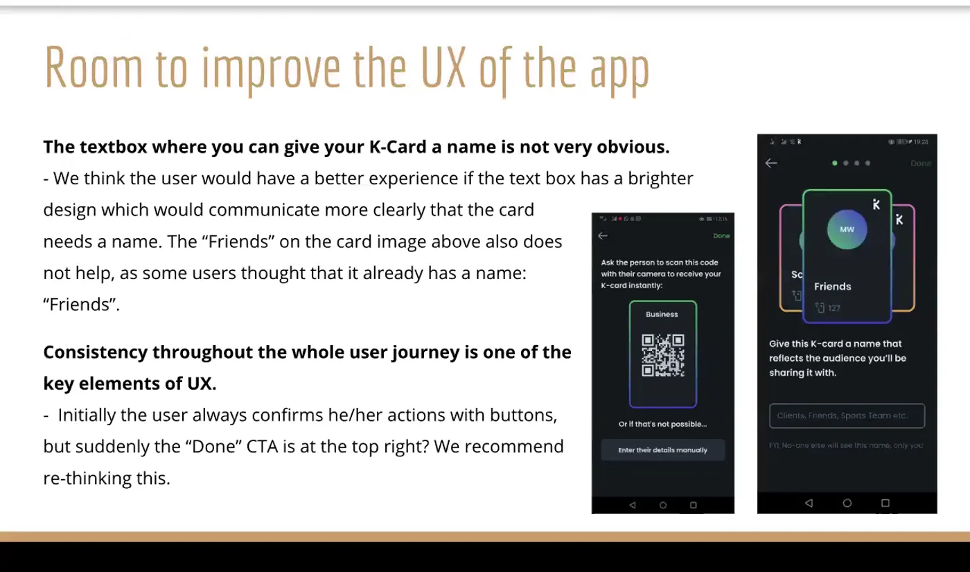
The team also identified usability issues outside the immediate feedback flow. Viewing your own K-Card let you trigger actions such as calling yourself, which the students recommended making context-sensitive - for instance, letting a user edit their own phone number instead. They also flagged that adding a social profile had no verification step, so a user could enter an incorrect LinkedIn URL by mistake, and recommended adding verification. They further suggested giving users a choice of communication channel - SMS, WhatsApp or Telegram - when messaging a contact, and recommended replacing the grey call-to-action colour, which testing suggested read as disabled or unavailable, with "a different and more encouraging CTA colour."
Next steps handed back to the client were to run more usability tests, test feedback requests at different points in the user journey, keep iterating on the prototype, and keep reviewing and improving the wording throughout the feedback experience.
The actual work.
Design artefacts captured from the recording of the team's final client presentation.
Who did the work.
Every cohort gets a real brief.
UX Academy courses are 100% live online, capped at 10 students, and built around a genuine client brief rather than a simulated exercise. Students work to the client’s real constraints and present their work back to the client — which is what turns a course project into a portfolio piece you can talk through in an interview.
Want a brief like this on your CV?
Get the full curriculum and see how the client project runs.
Work on a real brief. Build your portfolio.
Speak to an advisor about whether this is a realistic move for you, or browse the courses to find your fit.