LEM Verify
Identity verification & RegTech
A web-based identity verification product: users prove who they're with an ID photo and a liveness check, inside a flow other businesses white-label.
Why this brief existed.
Identity verification is a flow nobody chooses to be in. You're there because a bank, a landlord or a service won't let you proceed until you have photographed your passport and filmed your own face - and if you give up halfway, the business that sent you there loses you.
That makes the design brief unusually concrete. The team set three areas of focus: improve the completion rate, improve the speed of completion, and improve confidence and trust in the verification process. The first two are conversion. The third is the one that causes the first two.
Discovery produced four pain points, and none of them were cosmetic. Checklist fatigue, and having to hold multiple instructions in your head at once. Instructions that were more complex than they needed to be. Users unsure how to correct a mistake once they had made one. And no clear explanation of where the information goes or how it's used - which, in a flow where you're handing over your passport and a video of your face, is the whole ballgame.
The last one is the trust problem stated precisely. A user who doesn't know what happens to their data is a user deciding whether to finish.
“Rethink and optimise UX and flow of the current ID verification web app so that the process is easy to use for all demographics.”
What LEM Verify asked for.
Rethink and optimise the UX and flow of the current identity verification web app so that the process is easy to use for all demographics.
What the students worked within.
Who the design had to serve
People aged roughly 20 to 50 across the UK and Europe being asked to complete an identity check, with no assumption of prior experience. The brief's phrase "easy to use for all demographics" was the constraint that mattered: this isn't an app anyone opts into, so the design can't assume a confident or practised user.
Constraints in the brief
- The team couldn't access LEM Verify's real end users, for legal and security reasons, and said so on the slide rather than quietly working around it. They assumed the role of the end user themselves and used a mix of research methods to fill the gaps that created.
- The flow is white-labelled. Every screen has to carry a customer's branding alongside LEM Verify's, so the design had to work as a system that changes colour and logo rather than as a fixed look.
- Terms and consent aren't optional furniture - this is a regulated process, and the design had to place them somewhere that's both visible and not an obstacle.
- The liveness check requires someone to film their own face and follow spoken prompts in public or at their desk. Awkwardness was treated as a design problem, not a user failing.
What the team had to figure out.
No answers were supplied with the brief. These are the questions the students had to research, argue about and design their way through.
- How do you provide context and purpose for the verification process, so a user understands why they're being asked for this before they're asked for it?
- How do you reduce the amount of text while improving the explanation? Fewer words and more clarity usually pull against each other.
- How do you reduce the awkwardness of capturing a likeness video - the part where someone has to talk to their own phone and turn their head on command?
- How should terms and consents be managed, balancing visibility against presentation, in a flow where consent genuinely matters?
- When a capture fails, how does the user find out and how do they recover without starting again?
- How much of the process should be visible up front - how many steps there are, and how far in you currently are?
What the team actually did.
Taken from the team’s own final presentation back to the client — the research they ran, what it told them, and the design decisions it drove. Including the ones that didn't work.
Discovery was organised around four themes rather than a general trawl: knowledge and expectations, trust and security, information and visual complexity, and process complexity. Those four kept reappearing all the way through to the final recommendations.
From them the team defined four pain points and, deliberately, four matching goals - provide context and purpose for the process, reduce the amount of text while improving explanations, reduce the awkwardness of the likeness video capture, and manage terms and consents so they're visible without being an obstacle. Pairing each problem with a stated goal is what let them argue for specific design decisions later.
Those resolved into four solution areas: improve the onboarding experience, improve trust in the verification process, optimise the experience for a wider variety of users, and reduce the number of steps.
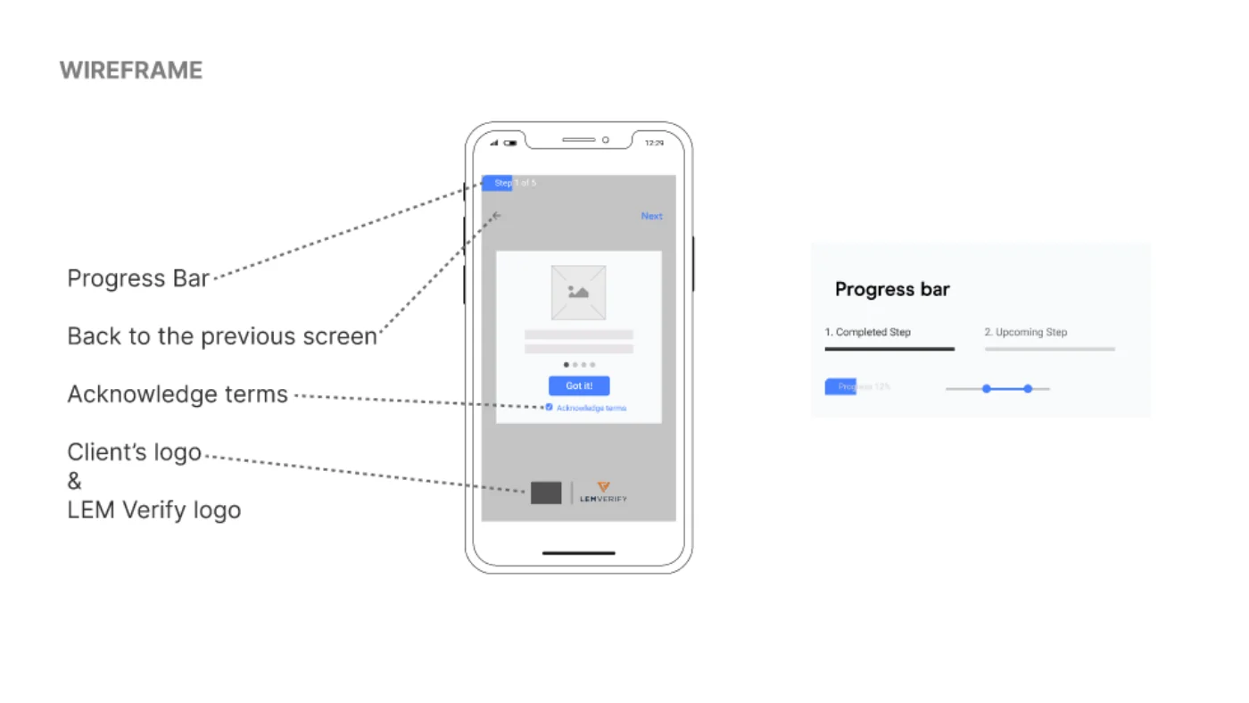
The wireframes were annotated with the reasoning, which is the part worth reading. On the onboarding screen: a progress bar, a route back to the previous screen, an explicit acknowledge-terms control, and both the customer's logo and LEM Verify's. The progress bar was specified as a component in its own right, with completed and upcoming states and a percentage rather than a step count.
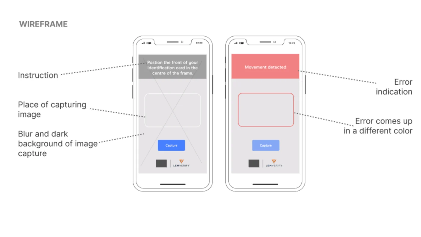
The document capture screen went further. The instruction sits at the top, the capture area is marked out, and the background around it's blurred and darkened so the eye goes to the one place it needs to go. The error state was designed as a first-class screen, not an afterthought: the failure is named in plain language - "movement detected" - and it comes up in a different colour so it's unmissable.
The prototype was tested against a written hypothesis: that the new UX improvements would reduce cognitive load and increase verification efficiency. Testers were aged 28 to 56 across EMEA and Australia, drawn from a spread of professions, and deliberately mixed between people with prior experience of identity verification and people with none.
What came back was triaged into three buckets - implemented, idea, and needs further research - rather than treated as one undifferentiated list. Implemented: more context for why the identity information is requested, a larger acknowledgement box, and a switch from step counts to percentage complete. Confirmed as working: the getting-started instructions were clear and explicit. Still open: clarifying where the data is used.
Some feedback was too big to absorb in the round and was passed back honestly as ideas and open questions - an initial menu asking for nationality so other document types could be supported, a notification confirming that data has been deleted, and a testers' question the team couldn't answer, which was why the document and the face aren't captured at the same time.
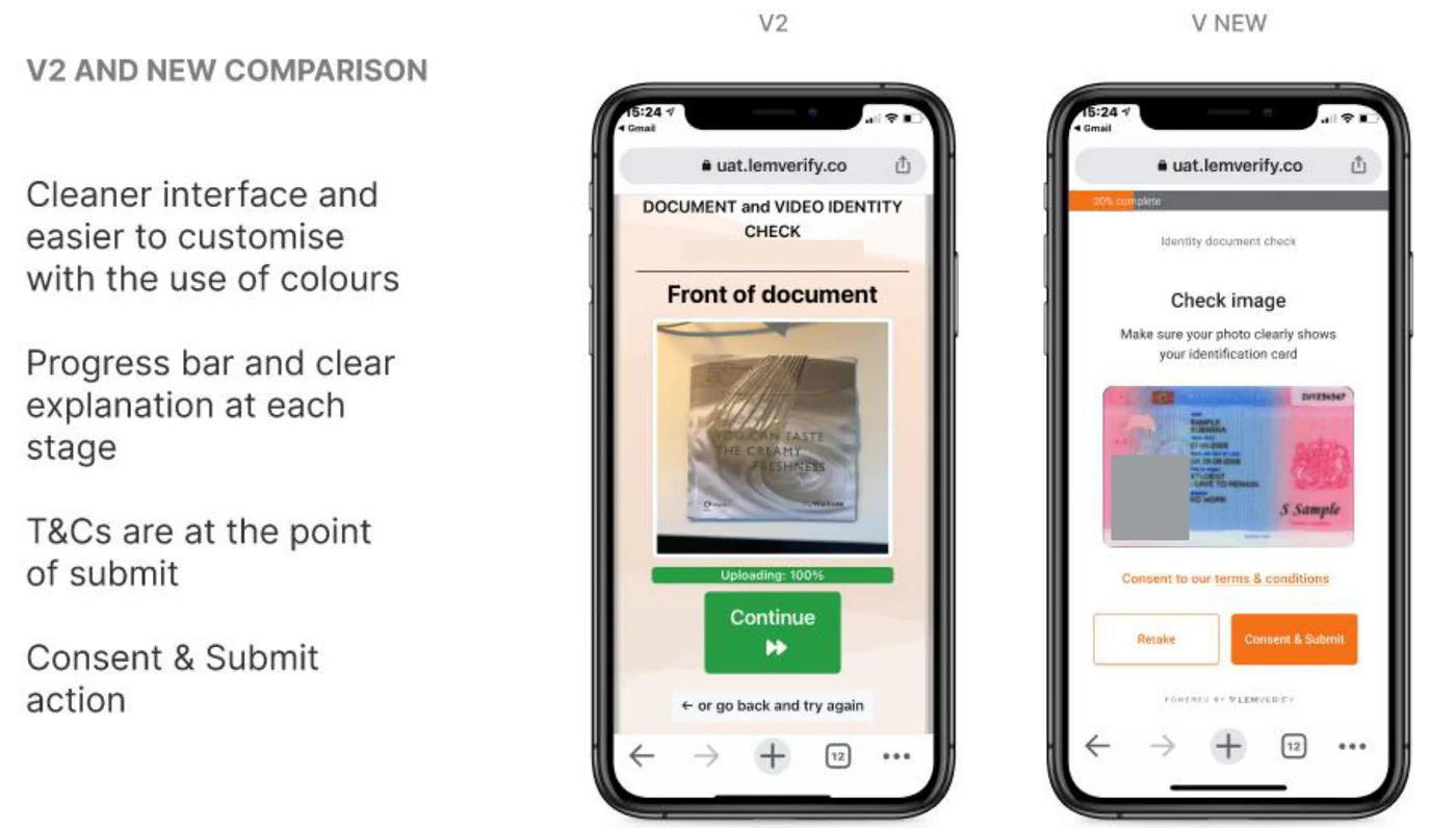
The before-and-after comparison shows what the work bought. The old flow led with a version string and an IP address, put terms and conditions early, and offered a green Continue with "or go back and try again" underneath. The new one leads with a percentage complete, names the step, tells the user what to check in the image, and puts consent at the point of submit - next to Retake, so the two available actions sit side by side.
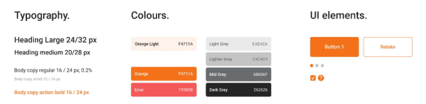
A UI style guide was handed over with it: a typography scale, a fixed colour palette including a dedicated error colour, a repeated icon language, consistent button placement, and the redesigned face-zoning used in the liveness check. That's what makes a white-labelled product re-skinnable without falling apart.
The actual work.
Design artefacts from the deck the team presented to LEM Verify.
Who did the work.
Every cohort gets a real brief.
UX Academy courses are 100% live online, capped at 10 students, and built around a genuine client brief rather than a simulated exercise. Students work to the client’s real constraints and present their work back to the client — which is what turns a course project into a portfolio piece you can talk through in an interview.
Courses that cover this kind of work.
Want a brief like this on your CV?
Get the full curriculum and see how the client project runs.
Work on a real brief. Build your portfolio.
Speak to an advisor about whether this is a realistic move for you, or browse the courses to find your fit.