Co-Plan
by Chris James · Shared living & communication
A mobile app that aims to improve the lives of people in shared accommodation.
A course project, not a client brief
A self-directed project. The deck names no client and contains no client brief -- the mission, the audience and the problem were all chosen by the team.
UX Academy cohorts also work on real client briefs for named companies, and those are published separately. This page is the other kind of portfolio piece: one a student chose, scoped and ran on their own.
What they chose to work on.
The team set themselves a mission before they set themselves a product: "To help the residents of a building improve their health and wellbeing." They chose to focus on residents aged 20 to 35 living in flat and house shares, and went looking for what actually goes wrong in those homes.
Research narrowed that down to something much more specific, and the team wrote the narrowed version out as the problem they wanted to solve: "To improve household harmony in shared living environments through better communication."
How they researched it, and what came back.
Two methods, chosen for different jobs. Face-to-face interviews were conducted in the homes of the participants, so the team could see how people actually live rather than how they describe living. A web survey was shared over social media to get a wider read.
The survey answer was mostly reassuring and slightly not: 75 per cent felt their shared home supported a healthy lifestyle, but 40 per cent had experienced at least one incident at home that had affected their wellbeing.
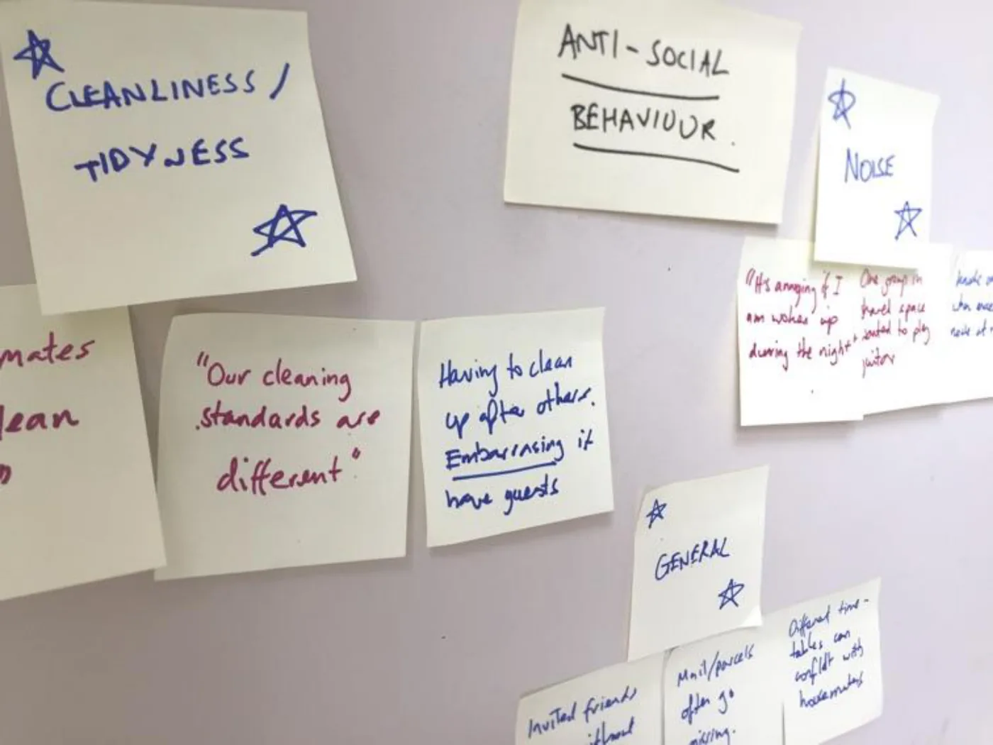
Affinity mapping the qualitative data grouped the complaints under one broader heading -- anti-social behaviour -- with cleanliness and tidiness, noise, and a general cluster (post going missing, clashing timetables, guests) underneath it.
The more useful finding was about what people do next. Housemates resolve these things face to face, over WhatsApp, over Facebook Messenger, or with notes pinned to the wall in the shared space. Many respondents preferred to do nothing at all, and one explained why in terms that go well beyond a tidy kitchen: "Nobody wants to be seen as making trouble: landlords can evict you, other tenants can assault you. This has happened to me before."
Digging further in the interviews, it became clear that anti-social behaviour was causing residents real stress, and that the stress was magnified whenever there was a clash over residents' schedules.
Methods used
What they designed.
Personas came before solutions, to hold the team to who they were designing for -- "the considerate one" and "the troublemaker", two housemates with very different ideas of what a shared flat is for.
The design bet followed directly from the research: if housemates could share and acknowledge each other's personal schedules, the app could replace the notes on the fridge and the WhatsApp messages, and defuse the stress that arrives with an unexpected event. A housemate flags something in their schedule that's likely to affect the others, so everyone can manage their own behaviour around it.
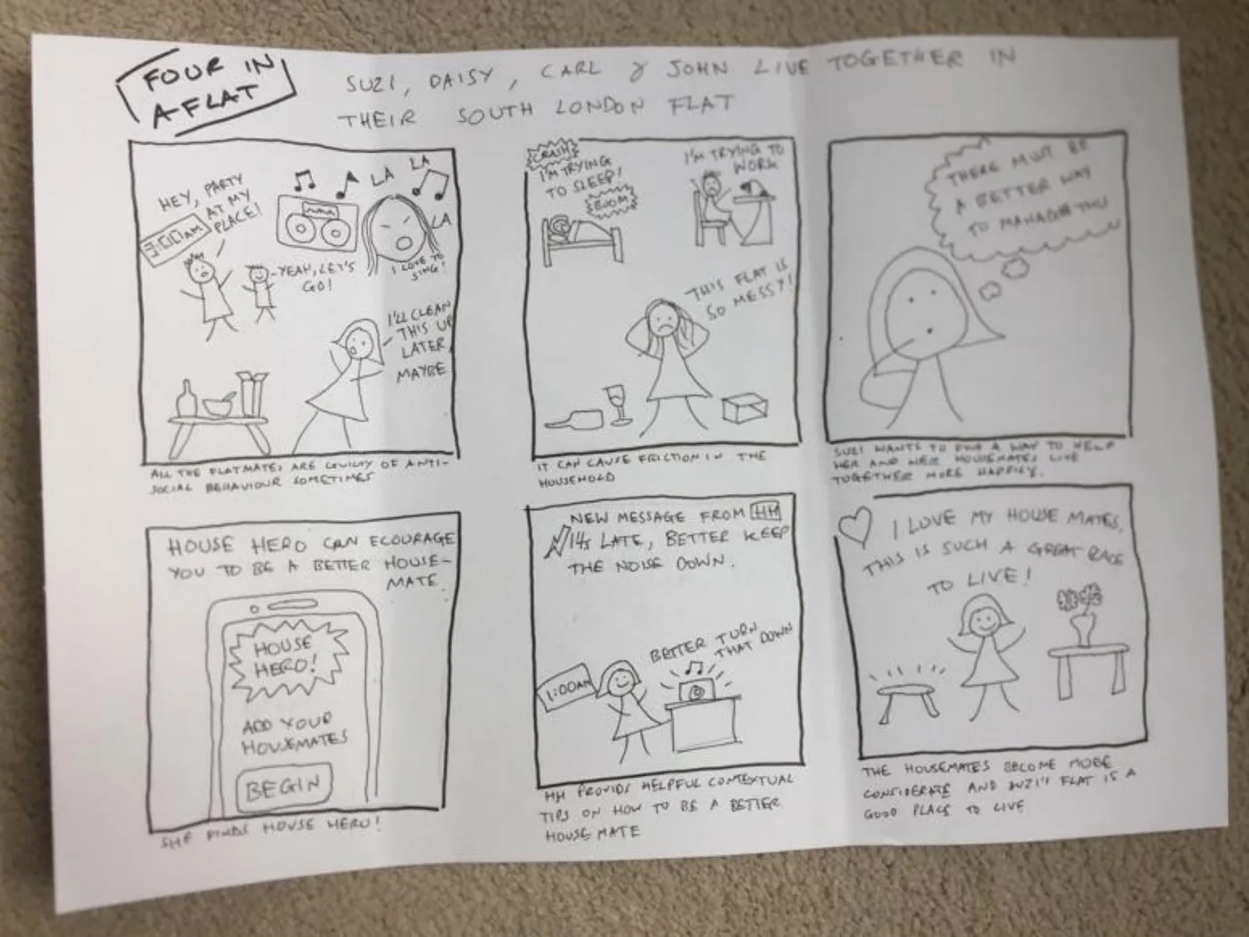
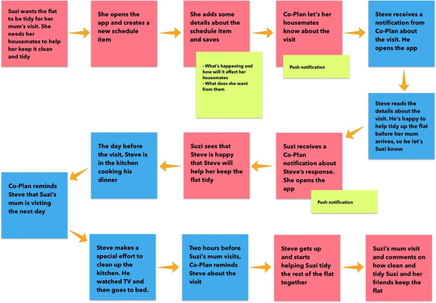
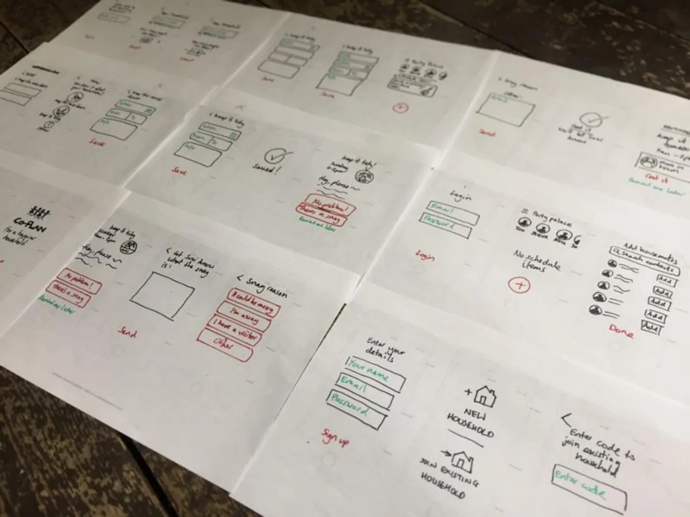
A storyboard was drawn to explain the concept to the rest of the team, followed by user journeys to work out where the app fits into a real week, and a user flow covering signup, the house dashboard, creating a schedule item, choosing how it affects the others, and the push notification that goes out.
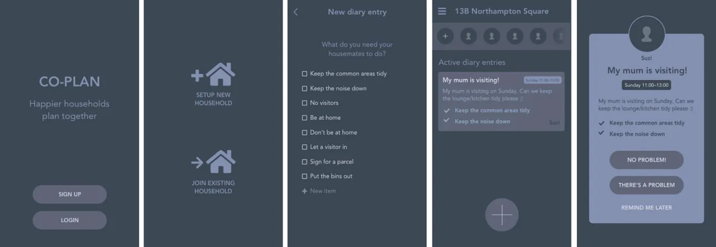
Screens were sketched at deliberately low fidelity so ideas could be iterated quickly, then assembled into a Marvel prototype for testing. A second, higher-fidelity round produced the wireframes for signup, household setup, a new diary entry built from plain checkboxes ("Keep the common areas tidy", "Keep the noise down", "Let a visitor in", "Put the bins out"), the house dashboard, and a response screen offering "No problem!", "There's a problem" or "Remind me later".
Built in: Marvel
The actual work.
Artefacts from the project deck by Chris James — the research boards, the sketches and the screens, as they were made.
What they learned.
Taken from the end of the deck, including the parts most people leave out. A portfolio project that reports what failed is worth more in an interview than one that only reports what shipped.
The first round of usability testing found flaws in the wording rather than the concept -- the phrase "There's a snag" confused people. Overall, test subjects completed the basic tasks and could see value in the idea, which is what justified building a more realistic prototype rather than starting again.
The second round was the more interesting one, and for a reason worth noting: the increased fidelity made the prototype feel more rounded in the testers' hands, which gave them the confidence to be more critical. Higher fidelity bought better feedback, not just prettier screens.
Two findings came out of it. The giant plus button on the dashboard, the control for creating a new diary item, wasn't as obvious as the designer thought it was. And the possibility of connecting to a third-party diary came up many times, unprompted. All participants understood the concept and completed the tasks they were given.
The deck closes without a launch or a result, and says so: the project is ongoing, with a plan to continue the build-test-learn cycle. To test the broad concept the team planned to piggyback on tools people already use -- WhatsApp and Google Calendar -- and run a diary study to see whether any of it changes residents' behaviour.
Who did the work.
Named exactly as the project deck names them. Where the deck gives first names only, first names only are published.
Two kinds of portfolio piece.
UX Academy courses are 100% live online and capped at 10 students. Cohorts work on a genuine client brief and present it back to the client — and students also run their own self-directed projects like this one, where they pick the problem, choose the methods and defend the decisions themselves. Both end up in a portfolio; they aren't the same thing, and this site doesn't present them as though they were.
Courses that cover this kind of work.
Want a project like this in your portfolio?
Get the full curriculum and see how the projects run.
Start from nothing. Finish with a portfolio.
Speak to an advisor about whether this is a realistic move for you, or browse the courses to find your fit.