Garden Buddy
by Emily Corfe · Consumer app & personalisation
A personalised gardening app that advises you on the best plants for your own garden.
A course project, not a client brief
The title slide reads "UX Academy project by Emily Corfe". There's no client and no commissioned brief -- the product idea, the research and the design are the student's own.
UX Academy cohorts also work on real client briefs for named companies, and those are published separately. This page is the other kind of portfolio piece: one a student chose, scoped and ran on their own.
What they chose to work on.
Garden Buddy is a guide to the whole gardening process rather than a plant catalogue: work out your soil and sun conditions, get plants recommended for the space you actually have, follow a watering and planting schedule, read honest reviews of the plants being recommended, and identify what's already growing.
The social half is deliberate. The app connects you to local gardeners and gives you somewhere to discuss problems, which is a direct response to what the survey said was missing.
How they researched it, and what came back.
The survey established who this is for, and the answer wasn't the person a gardening app usually pictures. Of the responses, 39 per cent kept indoor pot plants and 26 per cent had a small garden; large gardens accounted for 13 per cent, balconies 11 per cent, and roof terraces and allotments 5 per cent each. Most respondents had a small space or no outdoor space at all.
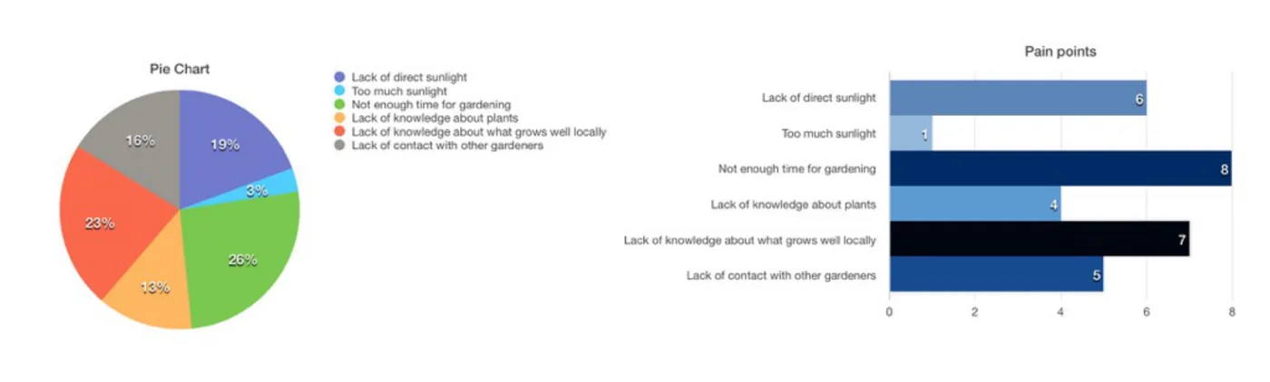
The pain points ranked in an order that shaped the whole product. Not enough time for gardening came first at 26 per cent, then lack of knowledge about what grows well locally at 23 per cent, lack of direct sunlight at 19 per cent, lack of contact with other gardeners at 16 per cent, lack of knowledge about plants at 13 per cent, and too much sunlight at 3 per cent.
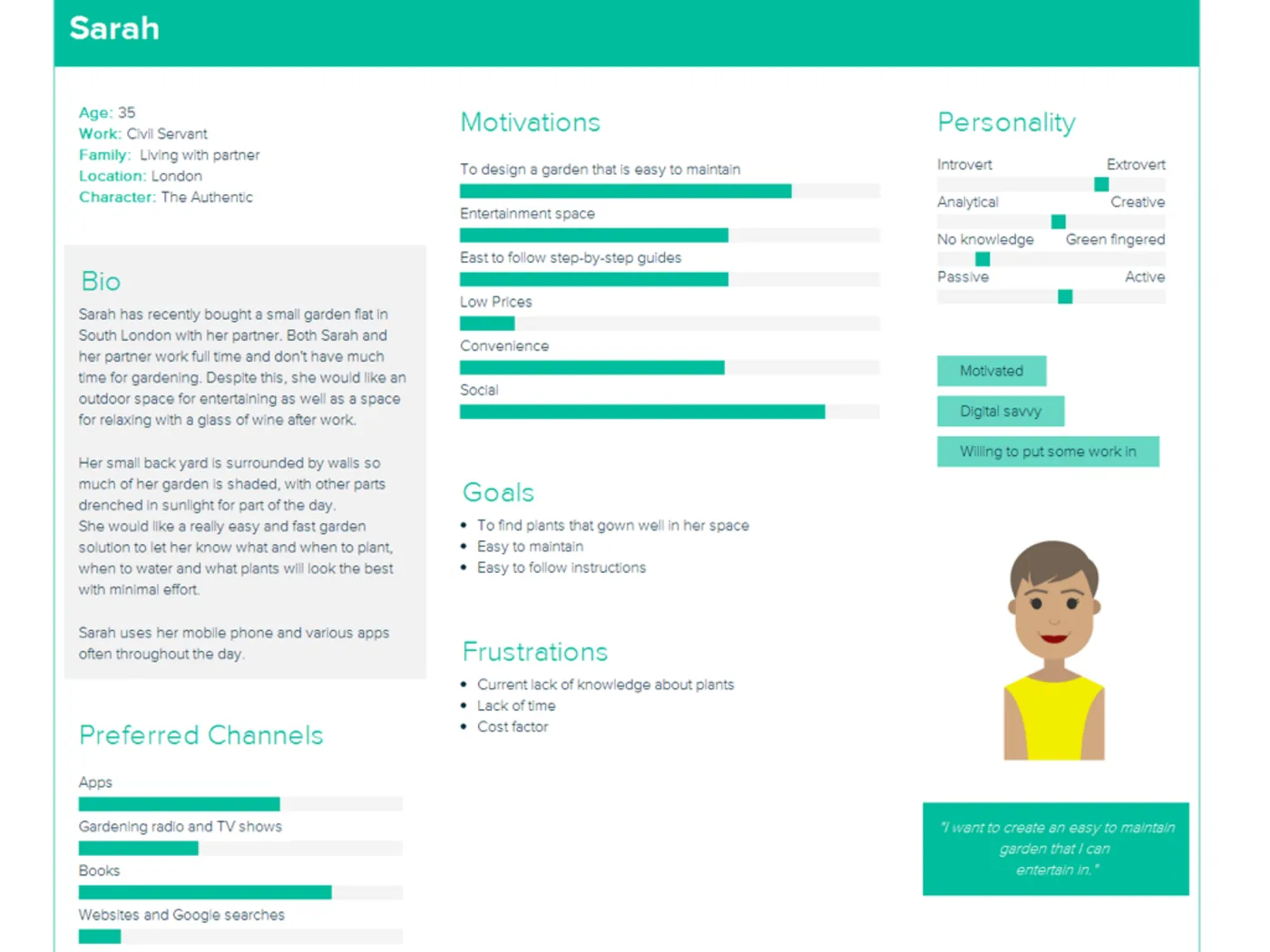
Interviews produced two personas at opposite ends of the range. Sarah, 35, a civil servant in London who has just bought a small garden flat with her partner: both work full time, the yard is walled and mostly shaded, and she wants something easy to maintain that also works as a space to entertain in. She's digitally confident and researches everything through apps.
Betty, 70, retired in Hertfordshire, has lived in the same house for years and has a large garden she enjoys as a way to unwind. She wants to make it more wildlife friendly and attract bees, finds hard physical work difficult, and gets her gardening information from Radio 4 and books. She's new to smartphones and willing to use an app if it makes life easier. The two personas pull in opposite directions on both knowledge and technology, which is the constraint the interface had to hold.
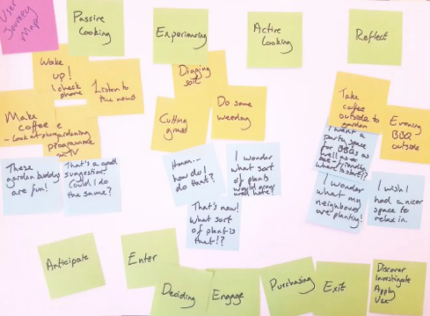
An empathy map followed a day in the life of a garden newbie, using emojis to mark how each event in the day made the user feel and where a touchpoint with the app could reduce the stress. A user journey map used three colours of note deliberately: yellow for general day-to-day tasks, blue for the user's thought process and where they could be directed towards the app, green to subdivide those into actionable groups.
Methods used
What they designed.
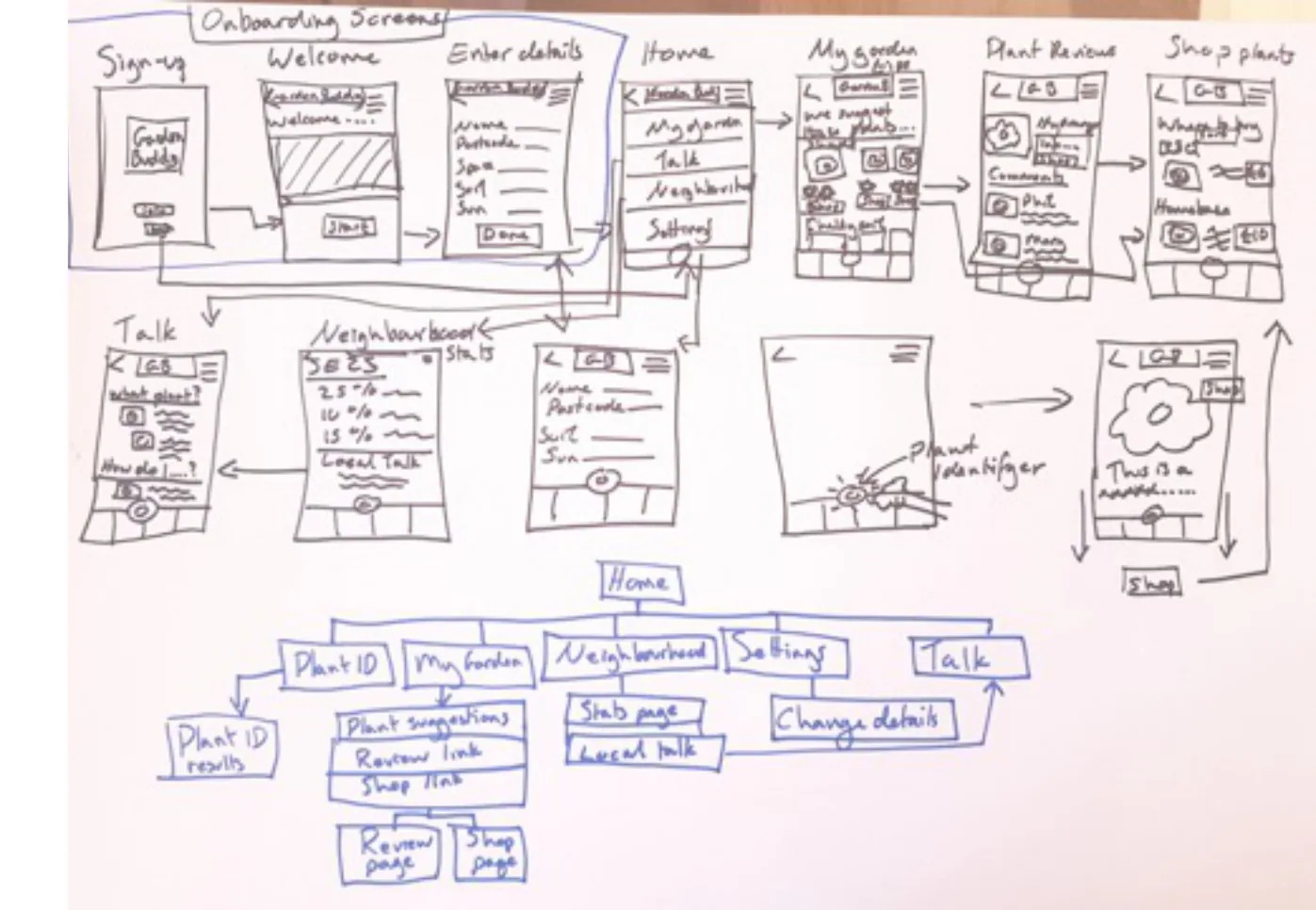
Paper wireframing came first, and the reason given for it's the honest one: sketching quickly and testing flow models without worrying about making mistakes. A basic sitemap was drawn underneath the wireframes to show the routes a user could take through the app.
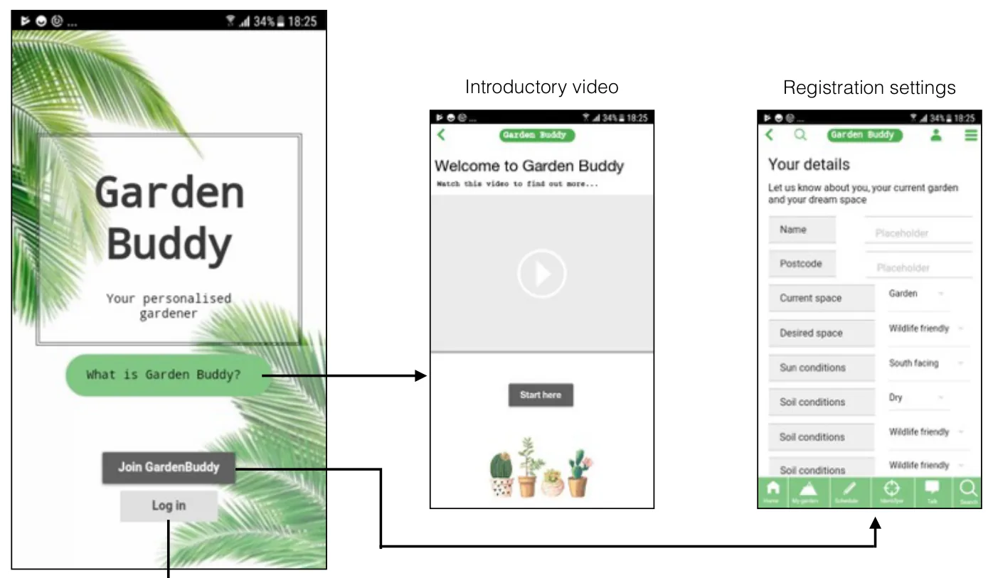
Onboarding is three screens: a branded first screen, an introductory video explaining what Garden Buddy is, and a registration form that's really the personalisation engine -- name, postcode, current space, desired space, sun conditions and soil conditions.
The home screen puts four things a click away: my garden, my calendar, the plant identifier and Talk. From there, a garden plan lists this month's tasks, a personalised garden screen recommends plants grouped by the conditions the user entered (shade-loving plants, plants that grow well in chalky soil) with star ratings and a buy option, and a schedule grid shows which plants need watering or planting on which day, with a notifications toggle.
The social screens answer the "lack of contact with other gardeners" pain point directly: a Talk screen listing local gardeners and active topics, individual gardener profiles, and a neighbourhood stats screen giving the shape of gardening in your postcode -- how many spaces are balconies, how many people want a social space, the most popular plant.
The plant identifier takes a photograph and returns results; a keyword search allows including and excluding words and filtering by the person who posted.
The actual work.
Artefacts from the project deck by Emily Corfe — the research boards, the sketches and the screens, as they were made.
What they learned.
Taken from the end of the deck, including the parts most people leave out. A portfolio project that reports what failed is worth more in an interview than one that only reports what shipped.
The write-up is strongest on process and thinnest at the end. User testing is listed among the research conducted, but the deck records no test findings, no iteration off the back of them, and no outcome, so none is claimed here.
The lesson the student does draw is about fidelity: the paper wireframing process was "invaluable" precisely because it removed the cost of being wrong, which let flow models be tested before anything was committed to.
Who did the work.
Named exactly as the project deck names them. Where the deck gives first names only, first names only are published.
Two kinds of portfolio piece.
UX Academy courses are 100% live online and capped at 10 students. Cohorts work on a genuine client brief and present it back to the client — and students also run their own self-directed projects like this one, where they pick the problem, choose the methods and defend the decisions themselves. Both end up in a portfolio; they aren't the same thing, and this site doesn't present them as though they were.
Courses that cover this kind of work.
Want a project like this in your portfolio?
Get the full curriculum and see how the projects run.
Start from nothing. Finish with a portfolio.
Speak to an advisor about whether this is a realistic move for you, or browse the courses to find your fit.