Music Services
by Amy, Paz and Louise · Music streaming & discovery
A concept for pulling several music streaming services into one place, so discovering music doesn't mean switching apps.
A course project, not a client brief
The deck opens "Group 1 - Amy, Paz and Louise" and gives first names only, so first names only are published here. There's no client: the subject is a category of product, not a company, and no brief was commissioned.
UX Academy cohorts also work on real client briefs for named companies, and those are published separately. This page is the other kind of portfolio piece: one a student chose, scoped and ran on their own.
What they chose to work on.
The team started from a written hypothesis rather than an idea: "We believe that users have been lost in many different music streaming services. Their main frustration is that all albums aren't available in every music streaming service, so they struggle to decide which one to use in order to find albums of their favourite artists."
They then wrote the research problem separately, which is what stopped the hypothesis from quietly becoming the answer: understand if people use more than one streaming service, and their motivation to do so. Only after that came the goal -- explore a solution that helps users manage all the music across their music services.
How they researched it, and what came back.
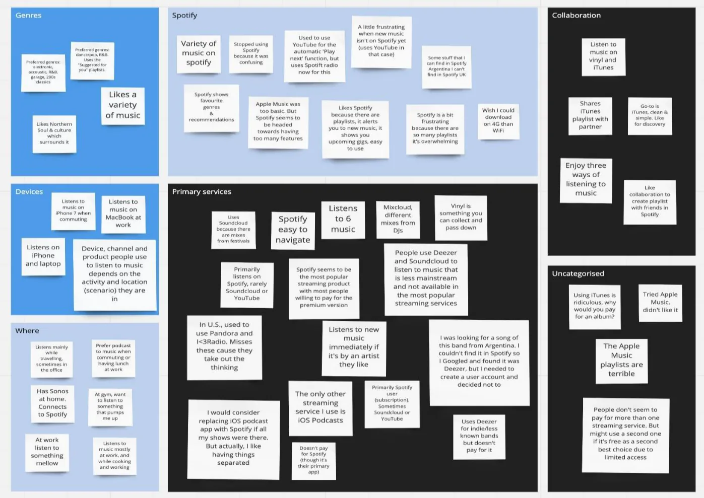
A question sheet was defined before any interviewing, covering the areas to get to: who the person is and what they're interested in, which services they use, why they chose that particular service, and where and how they listen to music.
Interviews were run and the outputs put on the wall, then grouped into themes: primary services, Spotify specifically, where people listen, collaboration, devices and genres. The raw notes carry the texture the summary loses -- a listener who couldn't find an Argentinian band on Spotify, Googled it, found it on Deezer, and decided not to create a second account; someone who would replace their iOS podcast app with Spotify if all their shows were there, but actually likes having things separated.
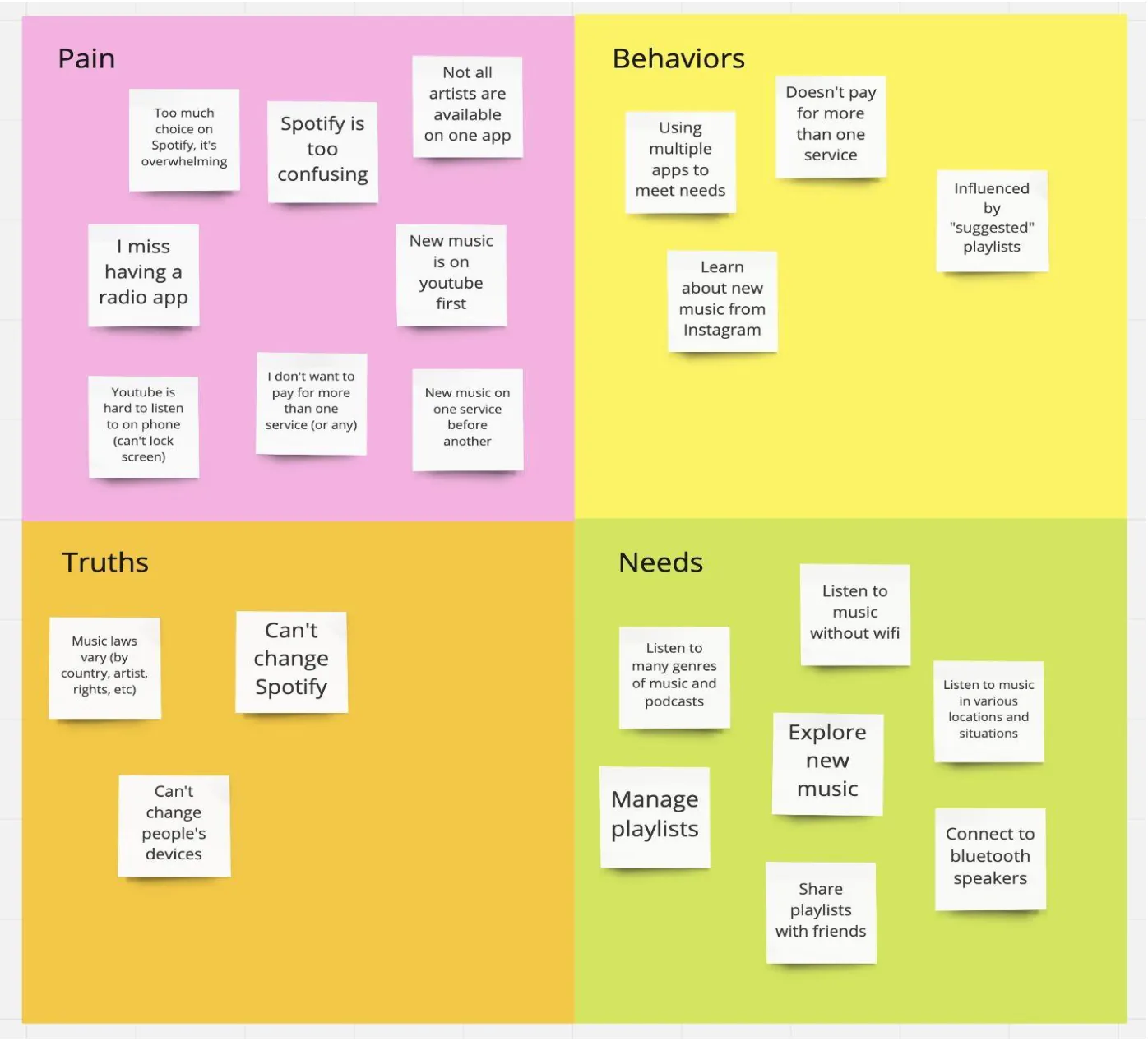
The findings were then reorganised into pains, behaviours, truths and needs, which is where the project got its shape. Pains: too much choice on Spotify, not all artists available on one app, new music appearing on YouTube first, not wanting to pay for more than one service. Behaviours: using multiple apps to meet needs, learning about new music from Instagram, being influenced by suggested playlists. Truths, which is the useful column: music licensing varies by country, artist and rights; you can't change Spotify; you can't change people's devices. Needs: manage playlists, explore new music, listen without wifi, share playlists with friends.
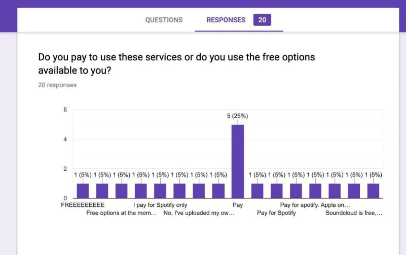
A survey of 20 respondents put numbers against it: nearly 30 per cent used Spotify; people liked Spotify because it recommends music and builds curated playlists from their listening habits; 20 per cent paid for Spotify, Amazon Music and YouTube Music; and Spotify worked across their devices.
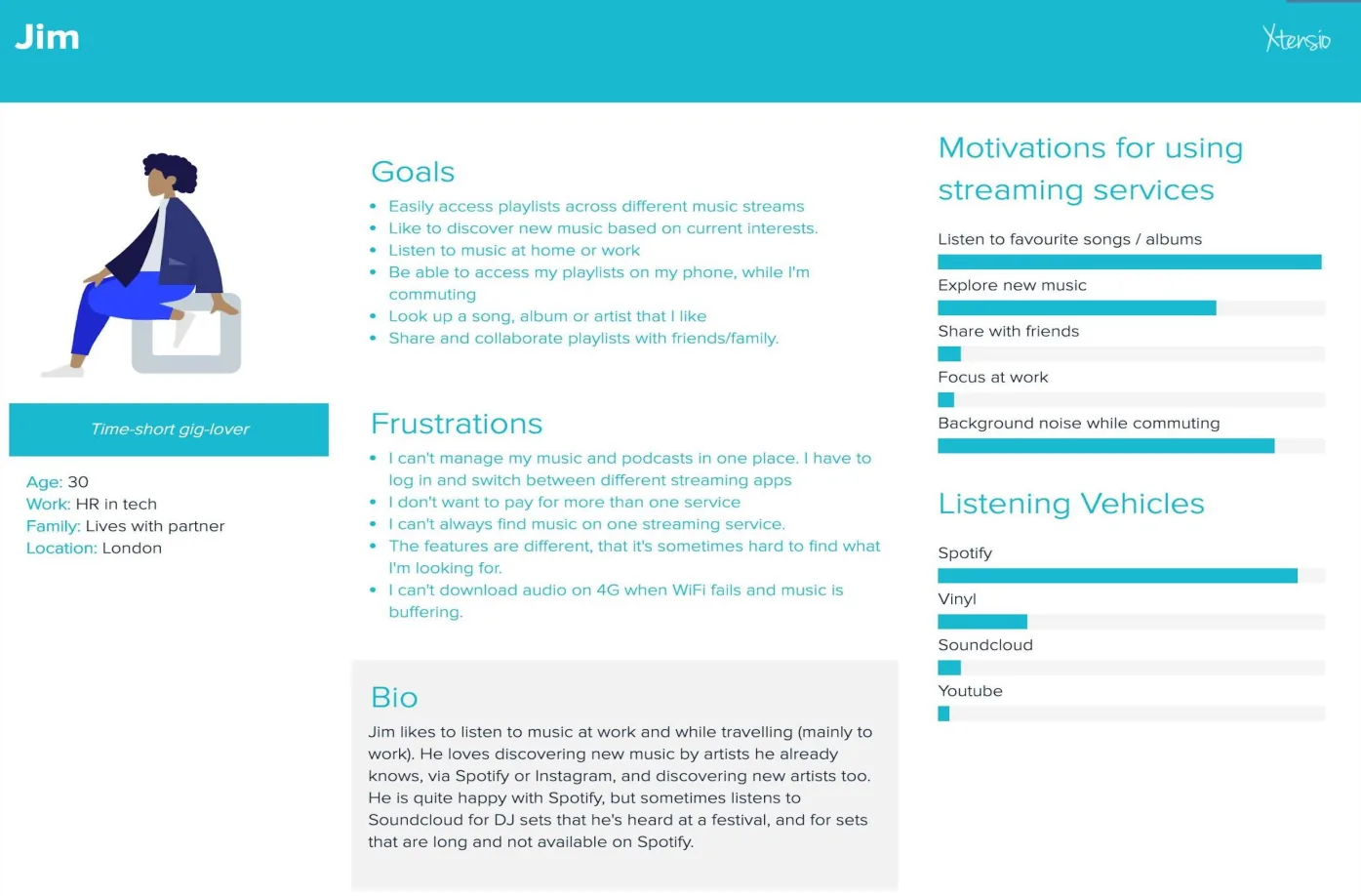
The persona built from all of this was Jim, 30, in HR at a tech company, living with his partner in London -- a "time-short gig-lover" who wants his playlists in one place across services, discovers music through artists he already likes, and is broadly happy with Spotify but goes to SoundCloud for the long DJ sets it doesn't carry.
The survey also captured what people wanted and couldn't have: Shazam integration with Spotify so a captured song could be saved for later, latest releases that aren't consistently available across services, discovery organised by type of music rather than by recommendation, and in-app music sharing.
Methods used
What they designed.
The How Might We was written to point at discovery rather than at aggregation for its own sake: "How might we enable people to discover new music more easily by creating a unified streaming experience?"
Three use cases scoped it: as a user I need to access all my playlists, I want to discover new music, and I want to organise my music in one place.
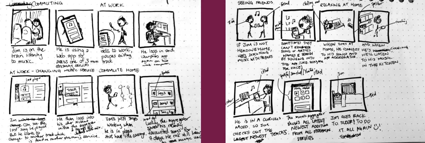
The experience was storyboarded across Jim's day -- listening on the train, switching service at work, discussing music with friends and searching by singing into the app, connecting to his speaker at home, checking the latest tracks before bed -- which is how the aggregator ended up being framed as something that follows a person between contexts rather than a screen they visit.
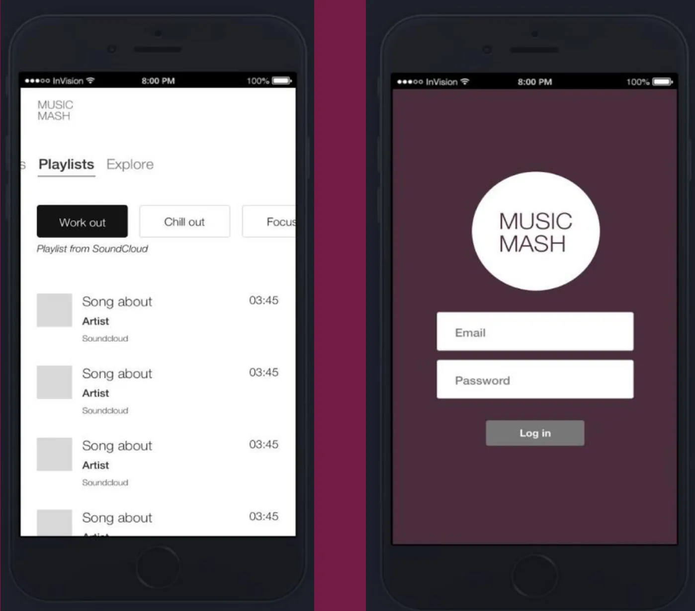
An InVision prototype was built under the name Music Mash: a login, then a playlists and explore view where playlists are grouped by what the listener is doing -- work out, chill out, focus -- with each playlist labelled by the service it's pulled from.
Built in: InVision
The actual work.
Artefacts from the project deck by Amy, Paz and Louise — the research boards, the sketches and the screens, as they were made.
What they learned.
Taken from the end of the deck, including the parts most people leave out. A portfolio project that reports what failed is worth more in an interview than one that only reports what shipped.
The most valuable slide in this deck is the one most people would leave out. Under "Challenges" the team listed, without softening any of it: time; "three woman team down to one"; "being a one man team means you can't give yourself instant feedback or suggest another way of doing something"; "Spotify satisfies most needs for users, it's difficult to understand"; and testing.
Losing two thirds of the team mid-project is a real constraint, and the effect named is the right one -- not that there was less work capacity, but that there was nobody to push back on a decision.
The design is explicitly unfinished, and the deck says so under Next steps: the prototype still needs another round of iteration to think about new music rather than trends, to let users focus on genres, and to be tested on a new group of people. There's no result and none is claimed.
Who did the work.
Named exactly as the project deck names them. Where the deck gives first names only, first names only are published.
Two kinds of portfolio piece.
UX Academy courses are 100% live online and capped at 10 students. Cohorts work on a genuine client brief and present it back to the client — and students also run their own self-directed projects like this one, where they pick the problem, choose the methods and defend the decisions themselves. Both end up in a portfolio; they aren't the same thing, and this site doesn't present them as though they were.
Courses that cover this kind of work.
Want a project like this in your portfolio?
Get the full curriculum and see how the projects run.
Start from nothing. Finish with a portfolio.
Speak to an advisor about whether this is a realistic move for you, or browse the courses to find your fit.