Welfound
Recruitment & talent marketplace
A referral-driven, AI-powered talent marketplace where professionals refer people in their network to highly relevant UK jobs.
Why this brief existed.
Recruitment runs on the recruiter's address book. Welfound's bet is that it shouldn't have to. Instead of a recruiter working their own network, a community of verified professionals refers people they genuinely know into relevant UK jobs, and AI joins the dots between the roles and the community.
The mechanic is straightforward. Companies post jobs. Those jobs are matched to relevant people in the community, who can apply themselves, refer someone, or share the role into their own social networks. The company receives a curated shortlist and runs the rest of the hiring process on the platform. Successful referrals result in referral bonuses and charity donations. Welfound wants three things out of that: more accurate matches, a better candidate experience, and lower hiring costs.
Which makes this a UX problem before it's a product problem. The brief is blunt that the platform is going against the grain of the traditional recruitment process and depends on a network effect to work at all. If the interface isn't intuitive, nobody adopts it - and without adoption there's no network.
“As we are going against the grain of the traditional recruitment process and have such a reliance on the networking effect for this to really work, the UX needs to be intuitive and super simple to drive its usability.”
What Welfound asked for.
Redesign the company-user flow for screening shortlisted applicants and managing applicant communication, making it intuitive and simple enough to drive adoption against the grain of traditional recruitment.
What the students worked within.
Who the design had to serve
Internal recruiters, HR managers and hiring managers inside UK-based businesses - specifically people who are, or have previously been, in a hiring capacity.
Constraints in the brief
- The MVP was nearing completion. This was design work inside a live product, not a greenfield concept.
- A two-sided marketplace - community members on one side, company users on the other - and the brief deliberately scoped the project to the company side only.
- Company users have five key activities: creating a company profile, job creation, job promotion and management, screening shortlisted applicants, and communication management. The brief narrowed the team to the last two.
- The design had to serve social-impact goals as well as efficiency ones, which shaped what could be shown about a candidate and how.
- The platform is built on Next.js and React with Material UI; design work in Figma.
What the team had to figure out.
No answers were supplied with the brief. These are the questions the students had to research, argue about and design their way through.
- How do you present a shortlisted applicant so a hiring manager gets a rounded understanding of their potential and skillset, beyond the hard skills a CV puts in front of them?
- What filtering does a company user actually need in order to surface the most appropriate person for a given set of criteria?
- How do you make the state of the pipeline legible at a glance - who's where in the recruitment process?
- What does the communication layer have to support: asking a candidate a question, requesting an interview, confirming it, rejecting someone, giving them feedback, making an offer?
- How do you present candidate information in a way that reduces bias, when qualitative bias reduction is one of the measures of success alongside candidate experience scores and the ratio of referrals interviewed or hired?
- What in the current company user flow is genuinely of value to the user, and what's only there because recruitment software has always had it?
What the team actually did.
Taken from the team’s own final presentation back to the client — the research they ran, what it told them, and the design decisions it drove. Including the ones that didn't work.
The team started from assumptions rather than pretending not to have any. They built a proto-persona of a hiring manager first, wrote down what they believed about him, and used it to recruit and steer four exploratory interviews with people currently or previously in a hiring capacity in the UK.
The interviews produced one finding that reframed the whole project: hiring managers don't have time to read. One put a number on it - "I spend 6-8 seconds to screen each CV. We [hiring managers] just don't have time." Another described the real bottleneck as being at the end, not the start: "It's more difficult to choose between the 10 final candidates than 100." Screening wasn't the hard part. Choosing was.
A second theme was fragmentation. Recruiters described information scattered across email, documents and separate systems, with manual re-entry between them, and named the risk that comes with it - sending confidential information to the wrong person. Communication was the other drag: chasing candidates for interview slots delayed hires, and self-scheduling came up unprompted as the fix.
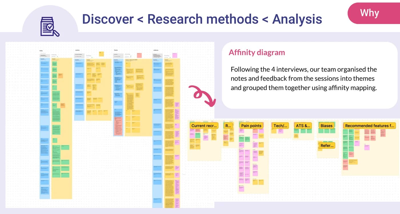
Affinity mapping the four interviews produced the list of information recruiters said actually decides a shortlist: degree, core skills specific to the job, previous experience and years of it, location, right to work, salary expectation. They were equally clear that soft skills and personality matter and that the interview, not the platform, is where those get assessed - which set a useful boundary on what the design should try to do.
The team then wrote out their remaining assumptions and open questions explicitly - how many candidates apply, how many get shortlisted, whether recruiters actually need to compare finalists, what device they work on - and carried them into concept testing rather than designing over them.
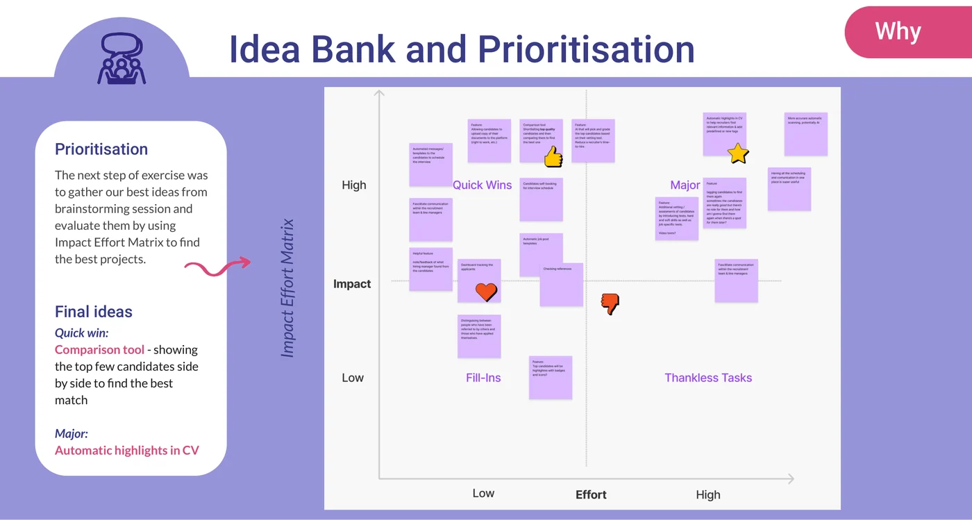
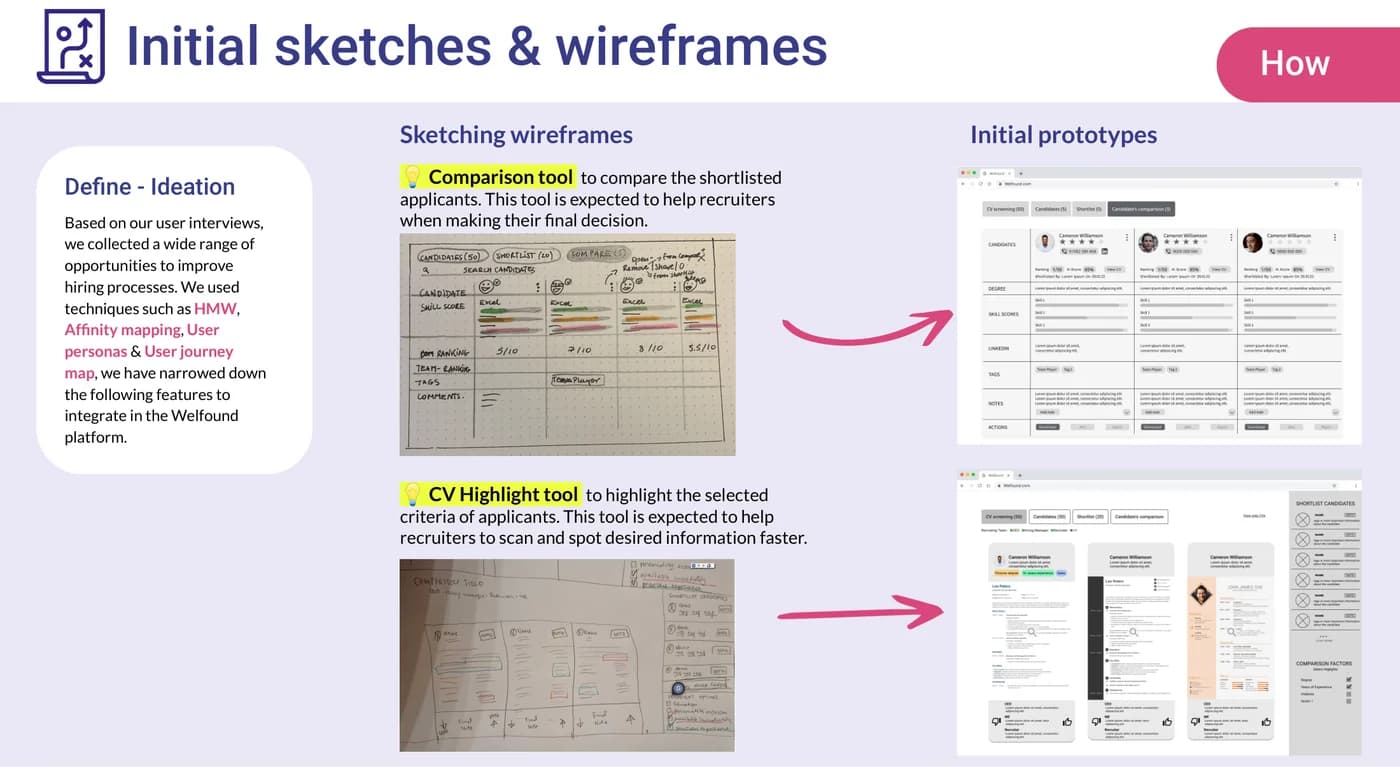
Ideas were run through an impact-effort matrix. Two came out: a comparison tool showing the top few candidates side by side, and a tool that highlights the selected criteria inside a CV so a recruiter can spot what they're looking for without reading the whole thing. The first was the quick win, the second the bigger build.
Concept testing asked two blunt questions - do users actually need these features, and is the layout easy to navigate. The comparison tool tested well against a real behaviour: "It can save us [recruiters] from having to create a spreadsheet of shortlisted candidates." The CV highlight tool got a more useful answer than a yes - "I would rather see a summary of key factors about the candidates than seeing their CV" - which pushed the design towards summarising rather than annotating.
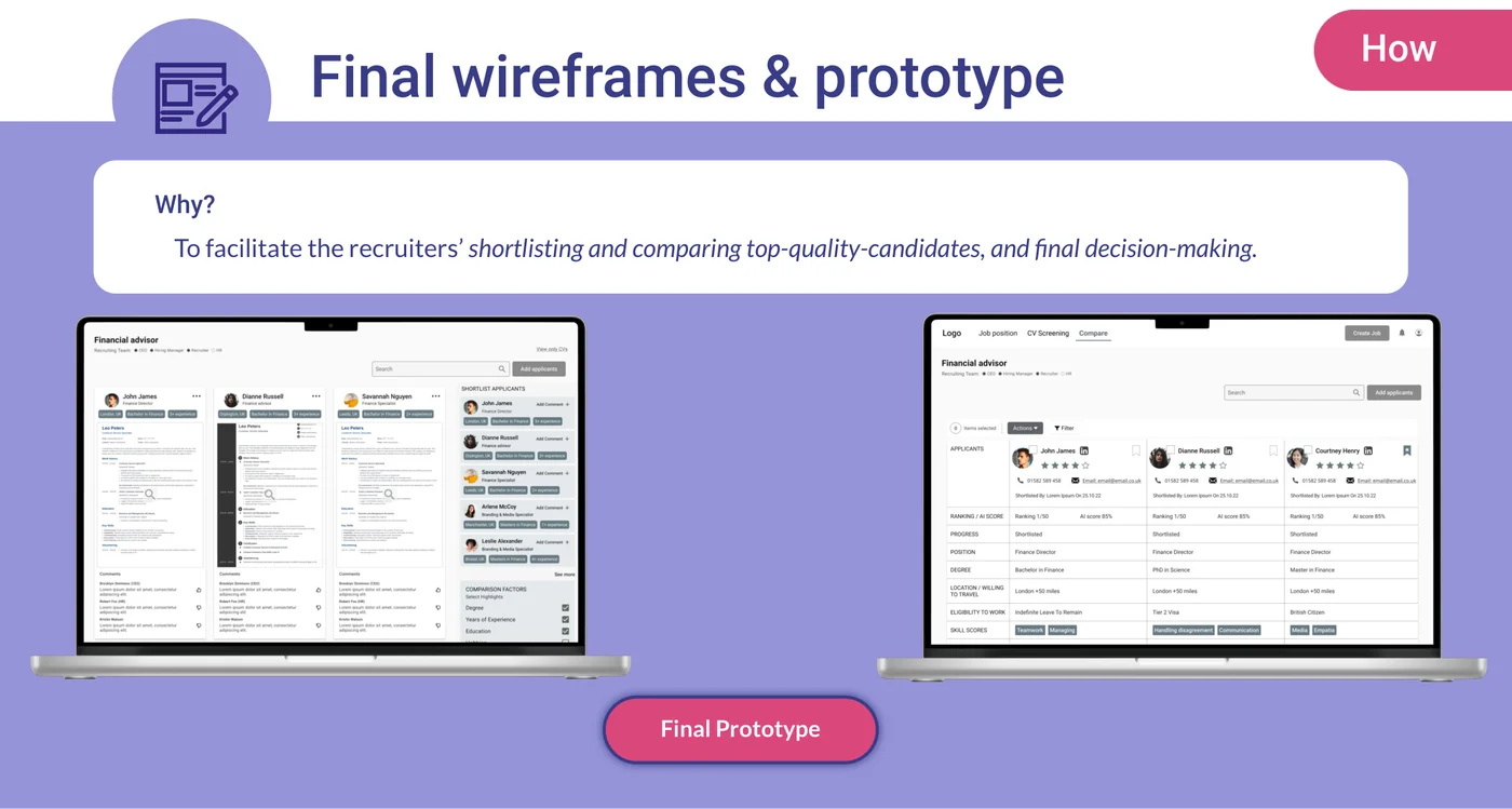
The final round amended navigation tabs, action buttons and applicant filtering, and the team handed back a set of opportunities they had evidence for but hadn't built: message and job-post templates, applicant self-booking into interview slots the hiring manager sets, and a single dashboard tracking every applicant through the process. On the AI matching at the heart of the product, one interviewee was direct about where the risk sits - the engine doing what it says on the tin is, in their words, most of the success of the platform.
The actual work.
Design artefacts from the deck the team presented to Welfound.
Who did the work.
Every cohort gets a real brief.
UX Academy courses are 100% live online, capped at 10 students, and built around a genuine client brief rather than a simulated exercise. Students work to the client’s real constraints and present their work back to the client — which is what turns a course project into a portfolio piece you can talk through in an interview.
Courses that cover this kind of work.
Want a brief like this on your CV?
Get the full curriculum and see how the client project runs.
Work on a real brief. Build your portfolio.
Speak to an advisor about whether this is a realistic move for you, or browse the courses to find your fit.