YourLanguageApp
EdTech & language teaching
A teaching platform for language schools; this project redesigned the teacher dashboard for building classes, publishing content and seeing student response.
Why this brief existed.
The dashboard is where a language teacher actually works: building classes, publishing content, and finding out whether any of it landed. The team's starting assessment was that it felt disjointed and that the platform lacked its own look and feel - a set of tools rather than a product.
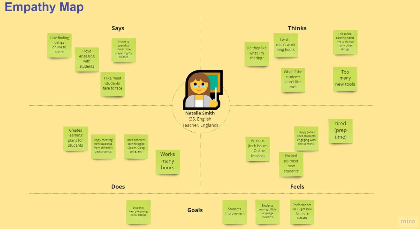
Interviews with current clients and experienced language teachers found the real cost of that. Teachers were spending most of their time working outside classroom hours on administrative tasks. One put a number on their week: "I work too many hours (49) per week." Every unnecessary click in an admin tool is coming out of somebody's evening.
The second problem was a blind spot rather than a burden. Teachers needed to see how students were responding to their content in order to make better content - and the thing they cared about most was invisible to them. "I love when my students engage with the content," one said. The dashboard couldn't show them whether that was happening.
The third was language, in a product about language. The vocabulary of the dashboard confused the people interviewed. One asked of a metric on screen: "What's consumption time? Is it reading, student, teacher?" Another was blunt about the landing page - it was weird, and what they wanted instead was a summary of their classes and courses.
The team drew a careful distinction that shaped everything after it. These teachers do work a lot with technology, and the navigation seemed easy enough to use. The problem wasn't operating the dashboard. It was understanding it.
What YourLanguageApp asked for.
Redesign the teacher dashboard so it works as one coherent product rather than a set of disjointed tools, is genuinely navigable by teachers who aren't especially tech-savvy, and helps them increase how much their students interact with the content.
What the students worked within.
Who the design had to serve
Language teachers using the platform day to day - the people building and publishing the content, not the students consuming it. They're comfortable with technology but not specialists in it, and a large share of their work happens outside classroom hours.
Constraints in the brief
- Brand identity mattered to the client. Every aspect of the product had to feel like an extension of the tools the client already had, so the redesign couldn't simply adopt a generic dashboard look.
- The dashboard had to work for teachers specifically. Ease of navigation was a stated requirement, on the basis that the users aren't especially tech-savvy.
- The existing information architecture and vocabulary were the thing under review, so the team had to be willing to rename what the product already called things.
- Success was defined in terms of student behaviour the teacher can influence - more engaging classes, and more visible student participation - not in terms of dashboard usage.
What the team had to figure out.
No answers were supplied with the brief. These are the questions the students had to research, argue about and design their way through.
- How might we make the tool easier to understand?
- Will a consolidated view help teachers see and quickly reach what they need, and get some of those 49 hours back?
- What would a teacher have to see about student engagement before it changed the content they made next?
- Which words in this dashboard are the product's words rather than the teacher's, and what should they be instead?
- Would showing a simple step-by-step process help a teacher understand the flow and logic of the dashboard, rather than having to hold it in their head?
What the team actually did.
Taken from the team’s own final presentation back to the client — the research they ran, what it told them, and the design decisions it drove. Including the ones that didn't work.
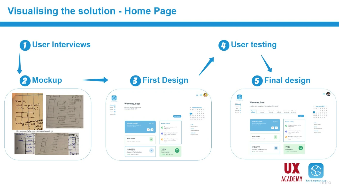
The team wrote down their initial assumptions before testing them - that the dashboard felt disjointed, that it needed to work for teachers, and that it should be easy to navigate for users who aren't very tech-savvy - and then interviewed current clients and experienced language teachers to find out which of those survived.
Four user problems came out, and the team turned each one into a hypothesis it could design against rather than a complaint. A consolidated view will help teachers see and quickly access what they need, and save time. Elements showing student engagement will help them create better content. Natural and familiar language will make the dashboard easier to understand. A simple step-by-step process will help them grasp the flow and logic of the dashboard.
The How Might We they settled on was deliberately unglamorous: how might we make the tool easier to understand? Not prettier, not faster - understandable.
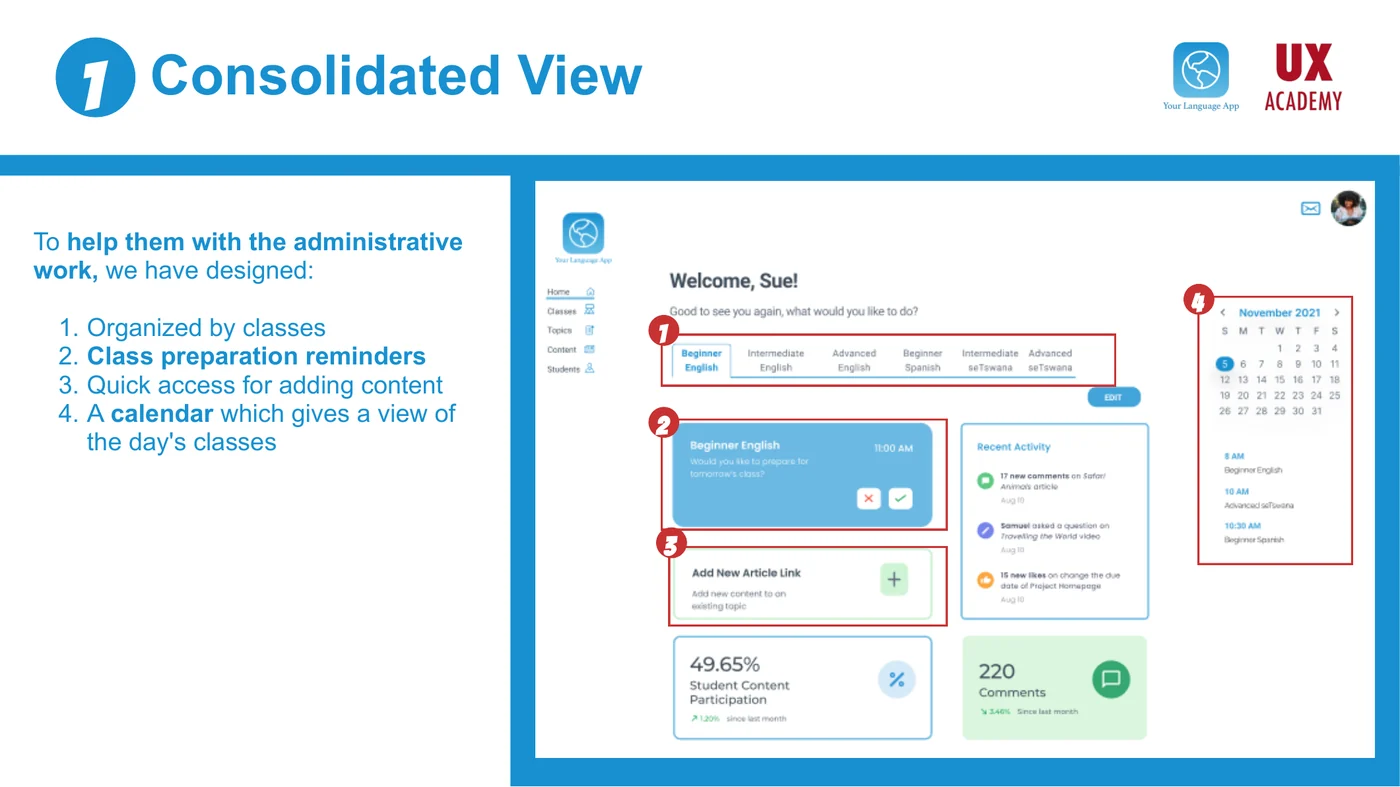
The consolidated view was built around the teacher's actual unit of work, the class. Content is organised by class, class-preparation reminders surface, adding content is a quick action rather than a journey, and a calendar gives a view of the day's classes. That last one is the difference between logging in to find out what's happening and logging in already knowing.
For engagement they added four things a teacher can act on: information per class, students' recent activity on published content, comment analytics, and student participation analytics. That's a direct answer to the teacher who said they love it when students engage but couldn't tell whether they were.
The language work went past renaming fields. The team set out to make the dashboard "feel like home" - speak to the teacher like a person, let them customise the homepage view, and personalise the user profile. The homepage that was described as weird became something the teacher arranges.
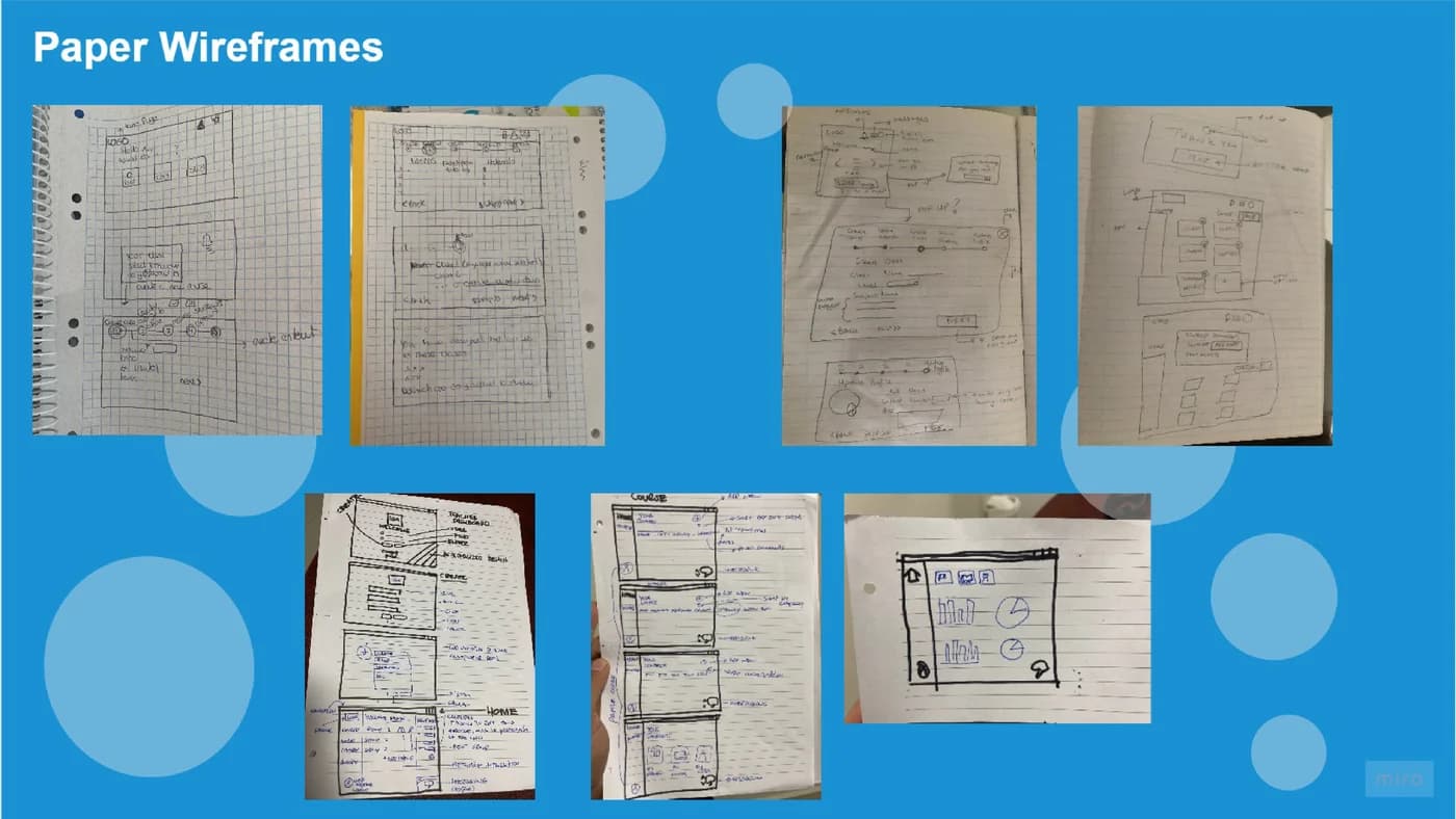
For the step-by-step process they used a stepper to show status and set expectations, and gave teachers control over movement through it - the ability to save as a draft and leave, and the flexibility at the end to publish now or later. Both are aimed at the same thing: a teacher working in the gaps of their day should be able to stop halfway and not lose anything.
The output was a high-fidelity dashboard in Figma, handed over with a next-steps list the team had evidence for but hadn't built: letting teachers set the site language to their own preferred language, integration with the other apps teachers already use to run their classes, direct student-teacher interactions, steppers extended across the other processes in the product, and separate profiles for school administrators and teachers.
The actual work.
Design artefacts from the deck the team presented to YourLanguageApp.
Who did the work.
Every cohort gets a real brief.
UX Academy courses are 100% live online, capped at 10 students, and built around a genuine client brief rather than a simulated exercise. Students work to the client’s real constraints and present their work back to the client — which is what turns a course project into a portfolio piece you can talk through in an interview.
Courses that cover this kind of work.
Want a brief like this on your CV?
Get the full curriculum and see how the client project runs.
Work on a real brief. Build your portfolio.
Speak to an advisor about whether this is a realistic move for you, or browse the courses to find your fit.