As part of our UX/UI Design Course, Alessandra was able to work on an existing app, Fledglink, which also allowed her to build her UX/UI portfolio.
About Alessandra
After working as a graphic designer and art director, I decided to pursue a career in user experience. I’m interested in working on products and services that can improve people’s lives. Hopefully I’ll be able to use my new skills and knowledge for that purpose. I’ve always centred my work around research. I observe behaviours and patterns to create services and designs that can enhance people’s experiences.

Project: Fledglink
My team and I worked on an existing app, Fledglink. This app is dedicated to teenagers searching for jobs and internships. Our challenge was to improve the app’s features. This included features like job searching, increasing the number of completed digital CVs, job applications through the app, and expanding the number of connections. After conducting qualitative research, we identified the main problems. With our users in mind, we successfully reorganised the app’s key features in an intuitive way. It was very satisfying to observe the difference during the usability test.
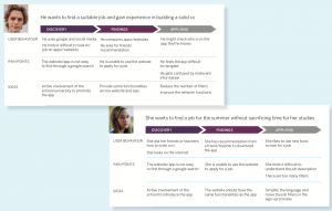
Problem Statement
Fledglink is designed to help teenagers find suitable jobs. We observed that the service isn’t meeting these goals due to the organisation of the content and the use of complex language. This is causing teenagers to struggle with using the app and seek outside assistance. We aim to improve this service to enhance our users’ success and experience.
User Personas

Journey Map
Minimum Viable Product
Keeping our users at the centre, we decided to begin with their first action on the app. Users need to fill in basic information during the sign-up stage to create a unique homepage. Second, we reorganised and prioritised the main features on the homepage (CV, network, blog, and attitudinal tests) to make them more visible. Thus, aligning them with our users’ needs and the app’s offerings. Finally, we simplified the app’s language which previously created difficulties.

Prototype
For our prototype we used an iPhone 6 as most of the teenagers. This was due to the fact that most teenagers cannot afford the latest mobile model. Based on the paper wireframes, we created a digital low-fi prototype. Next, we conducted three user tests.
Insights
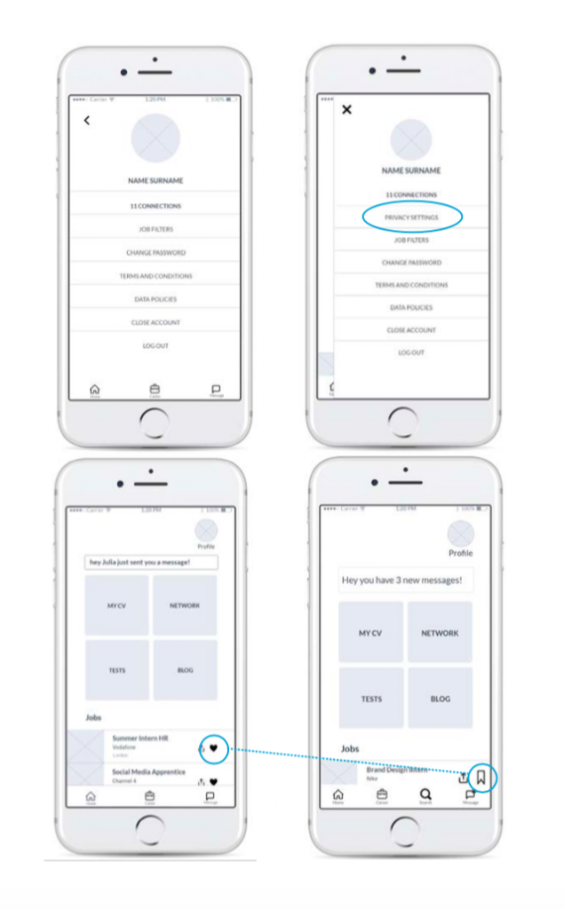
The majority of users found the app easy to use, with useful features and relevant information. They liked that they could connect with other people. We added more functions and modified it accordingly to what we observed during the usability test.
For example, they were concerned about privacy. Therefore, we added the option ‘privacy settings’ to their profile where they could decide what other people can see. Then we noticed how they responded to certain icons. For example, we used a heart icon to save a job or a feature from the blog. However, that icon was understood as a rating icon like on Instagram. As a result, we changed that icon with a bookmark.
Student Testimonial
When I attended the course I had read books and articles and I also did a three day bootcamp. But, during my UX/UI Design Course at UX Academy I had the chance to practice the entire process in-depth and understand the principles to apply in a future job. Also, there was a chance to step out of my work routine and be more aware of soft skills which are very important in team work.
Click here to see the full prototype.
Whether you want to start a career in UX, or just diversify your skillset in general, UX Academy has several courses available to suit your needs. Work on real client projects and build your UX/UI portfolio when you join UX Academy.