HopStair
for HopStair Limited · Wellbeing & confidence coaching
A nudge-based mobile app helping people build authentic, lasting confidence through daily prompts, peer support and, in time, a coaching marketplace.
Why this brief existed.
Between 50 and 70 per cent of people say they lack confidence and would like more of it. The trouble, in HopStair's framing, is that confidence is poorly understood - most people who want more of it have no idea how you actually build it, and there's nothing affordable and easy out there to show them.
That gap matters because confidence is foundational and preventative. The brief puts it directly: confidence sits at the heart of strong mental health and wellbeing, resilience, alignment with purpose, productivity, and the ability to achieve goals.
Coaching is the thing that works. It's also hard to get. People often don't know what coaching is or what it can do; coach and client are frequently mismatched; and it's expensive. HopStair's answer is to start much lighter - a nudge-based app that prompts people daily, plus a peer-to-peer space to share experiences - so the first step is available to anyone.
“We would like a final and user tested design that is attractive and sticky, and that starts to maximise user retention within the app.”
What HopStair Limited asked for.
Design the end-to-end MVP: consolidate ideas spread across multiple Figma files, fill the gaps in the user flow, and test a sticky onboarding-to-dashboard journey built to maximise retention. The team worked directly with the CEO and a human-computer-interaction academic.
What the students worked within.
Who the design had to serve
People aged 18 to 25, starting with university students. Medium to high educational backgrounds, heavy social media and smartphone users, keen to learn about themselves and to get past specific barriers to confidence. The important detail for a designer is that they rarely name the problem as low confidence: what they notice is self-doubt, low mood, anxiety or self-criticism. The confidence issue sits underneath. The brief flags this as exactly why the messaging and the funnel matter as much as the screens.
Constraints in the brief
- Four separate Figma files. Previous UX Academy cohorts and an in-house designer had left a lot of good thinking scattered across them. The first job was deciding what to keep.
- Not a blank page. A prototype already existed and had been extensively tested; this project was completing the design of the full MVP, an enhanced version of that prototype, ready to be coded and launched.
- Gamification was being designed in parallel by a separate project, and was to be incorporated rather than invented.
- Summarised user feedback and insights from earlier UX work on the app had to be carried forward, not set aside.
- The design had to be appropriate for responsive mobile app use.
- The team worked directly with the CEO, a part-time in-house designer, and a human-computer-interaction academic.
What the team had to figure out.
No answers were supplied with the brief. These are the questions the students had to research, argue about and design their way through.
- Which of the ideas spread across four Figma files earn a place in the MVP - and which screens are missing entirely?
- How do you make the dashboard the 'front room' of the app: one screen holding all the key information, routing to every sub-screen, and interesting enough that people want to interact with it?
- What should sign-up, onboarding, assessment, personalisation and tutorials do so a new user arrives set up rather than dropped in?
- How should the nudges and their supporting content be presented, given nudges are the core engagement mechanic the whole product rests on?
- How do the sub-screens fit together - a library for saved content, an insights screen for notes, and a stats screen for mood and confidence recordings - without cluttering the dashboard?
- What makes the end-to-end flow consistent enough, and sticky enough, to bring someone back day after day?
The actual work.
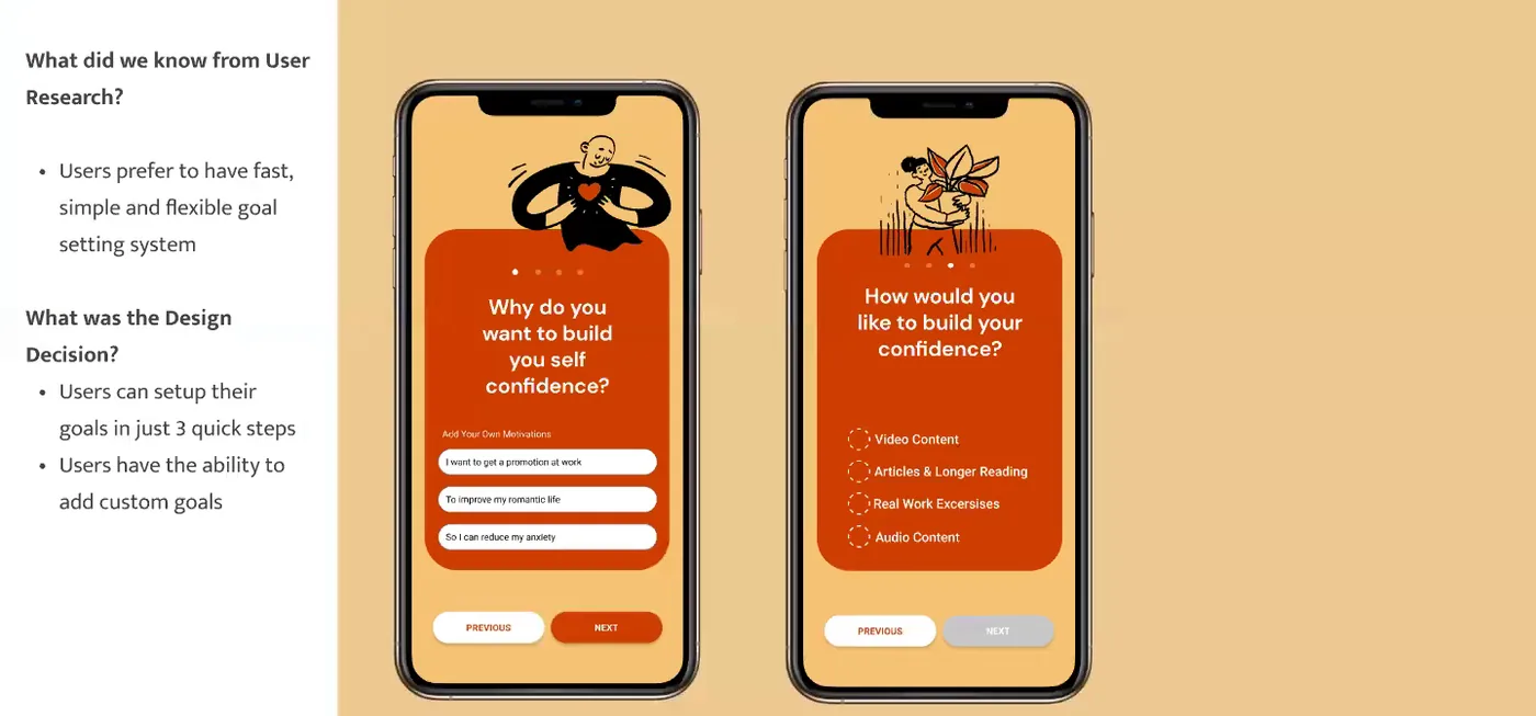
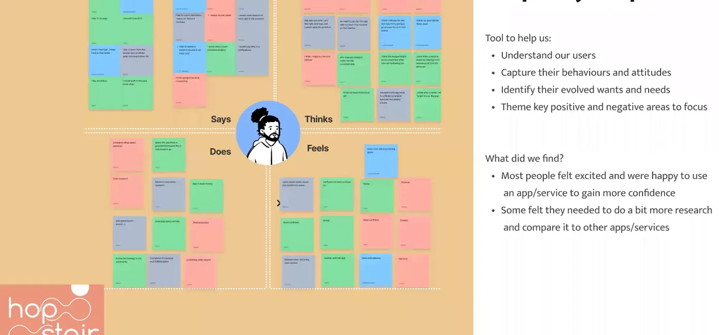
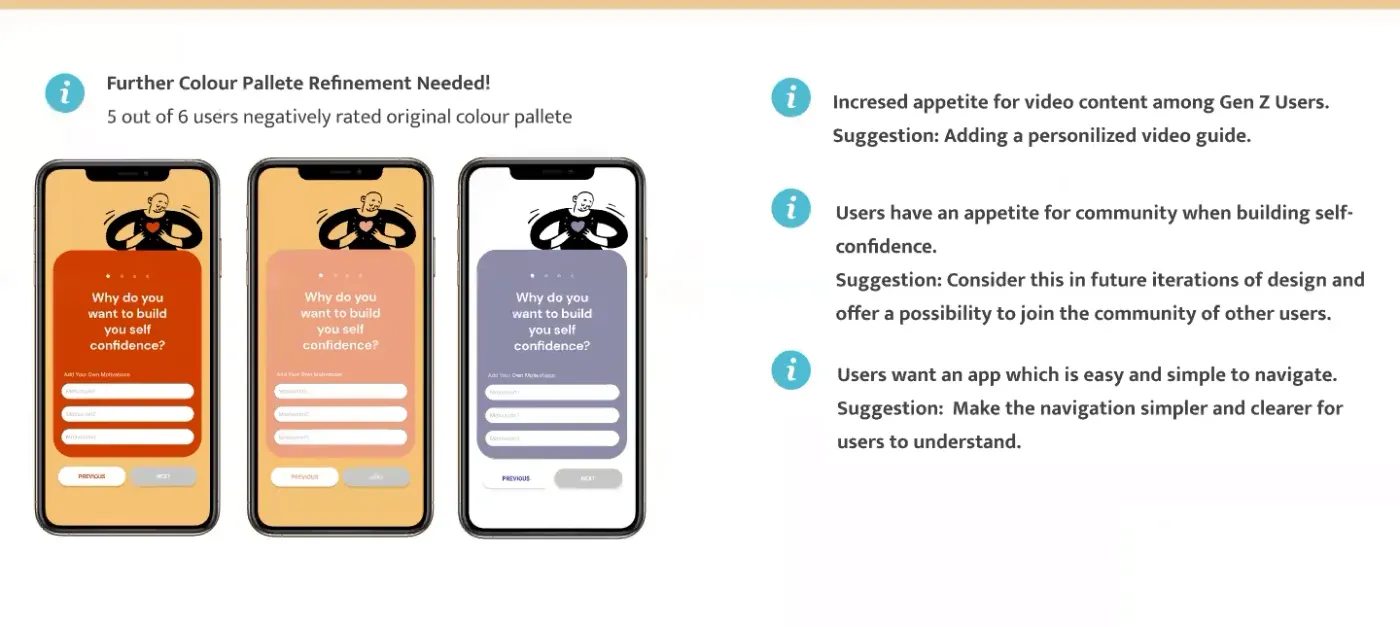
Design artefacts captured from the recording of the team's final client presentation.
Every cohort gets a real brief.
UX Academy courses are 100% live online, capped at 10 students, and built around a genuine client brief rather than a simulated exercise. Students work to the client’s real constraints and present their work back to the client — which is what turns a course project into a portfolio piece you can talk through in an interview.
Courses that cover this kind of work.
Want a brief like this on your CV?
Get the full curriculum and see how the client project runs.
Work on a real brief. Build your portfolio.
Speak to an advisor about whether this is a realistic move for you, or browse the courses to find your fit.